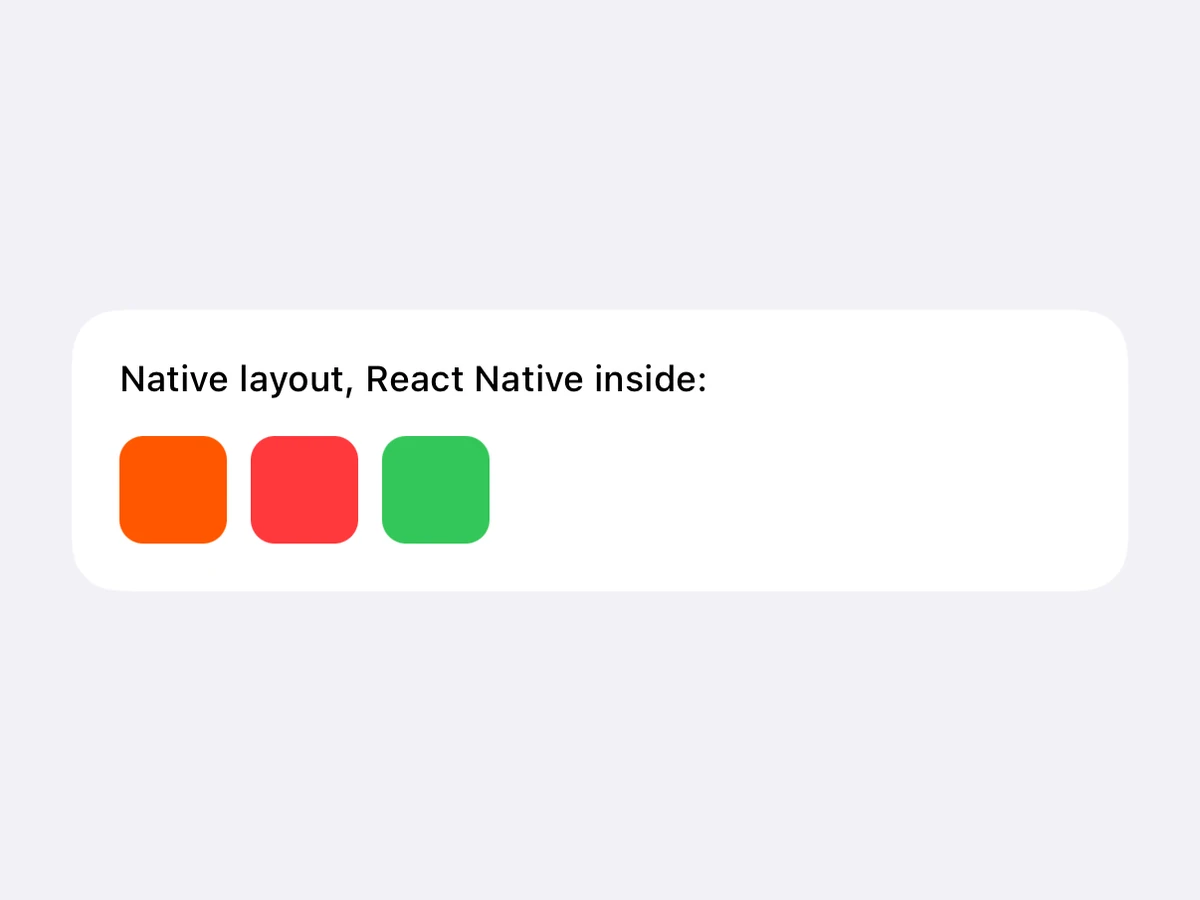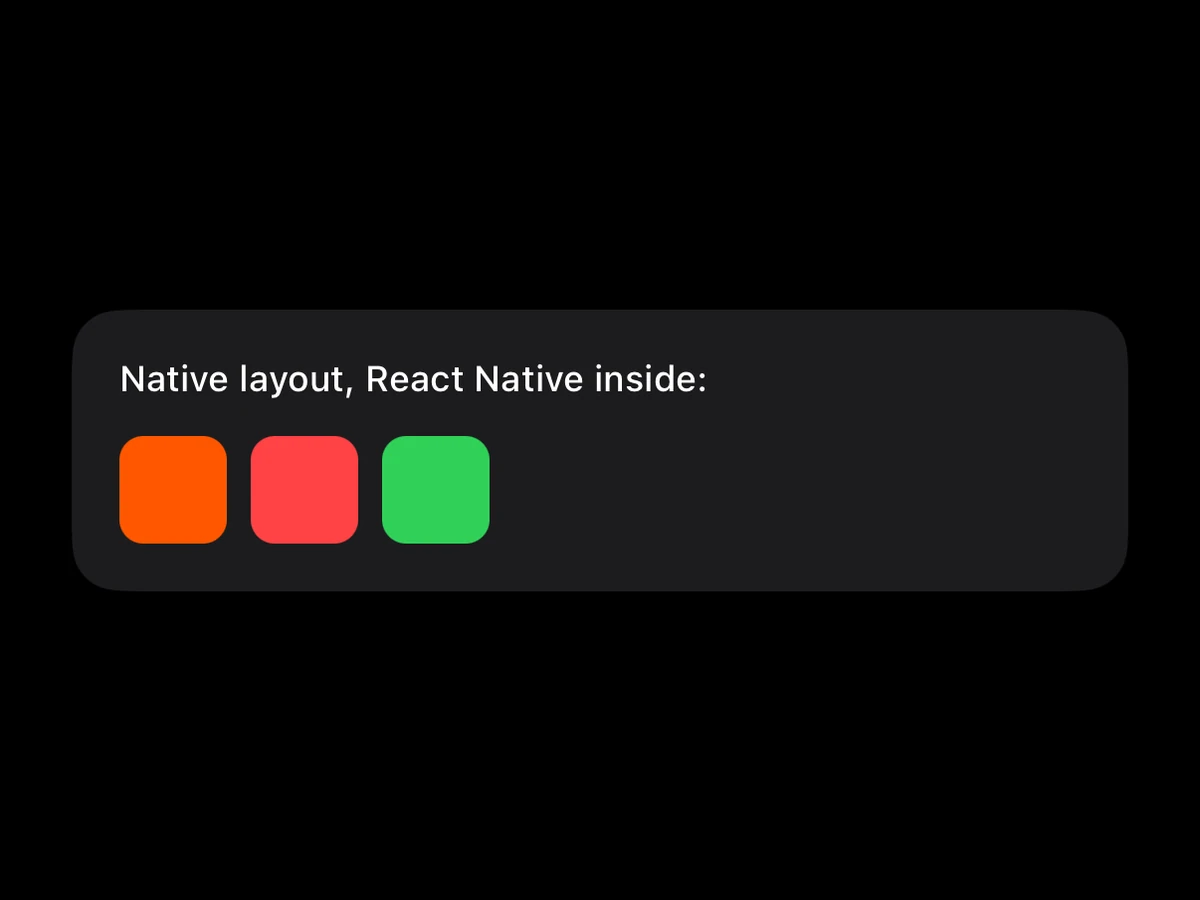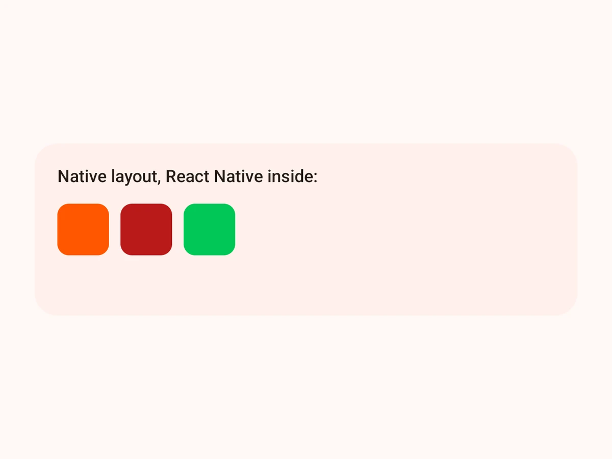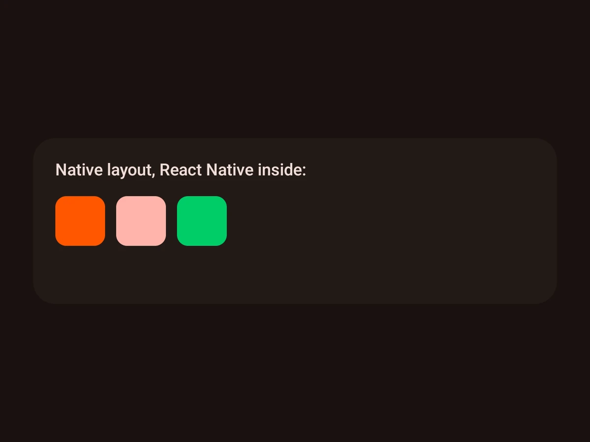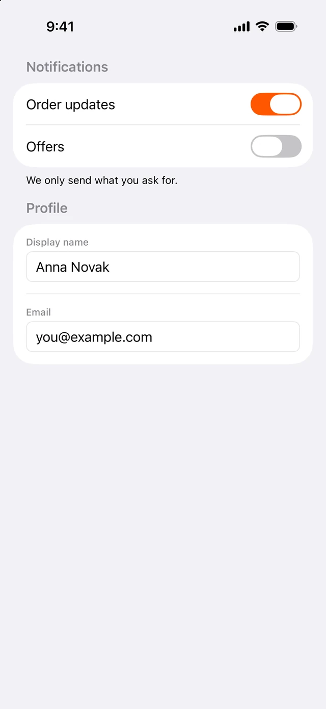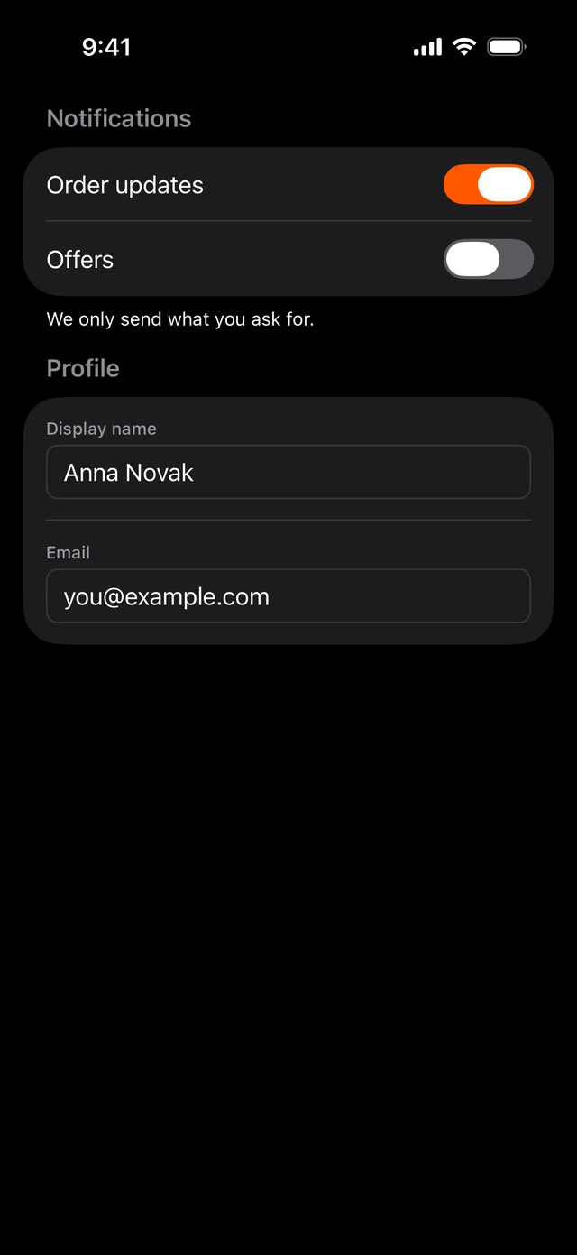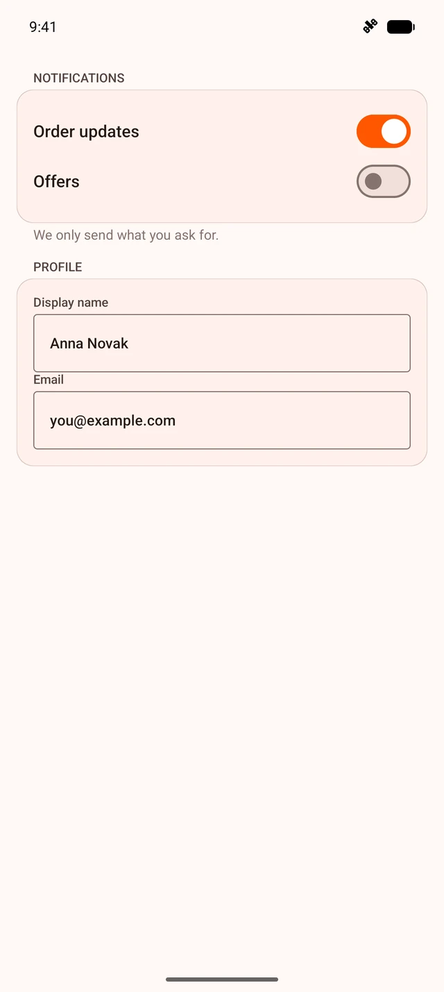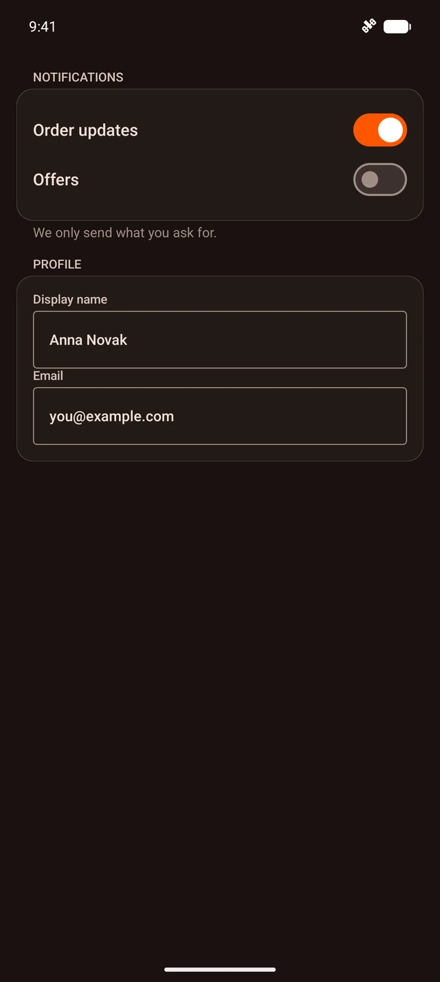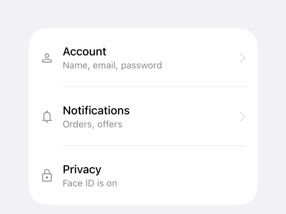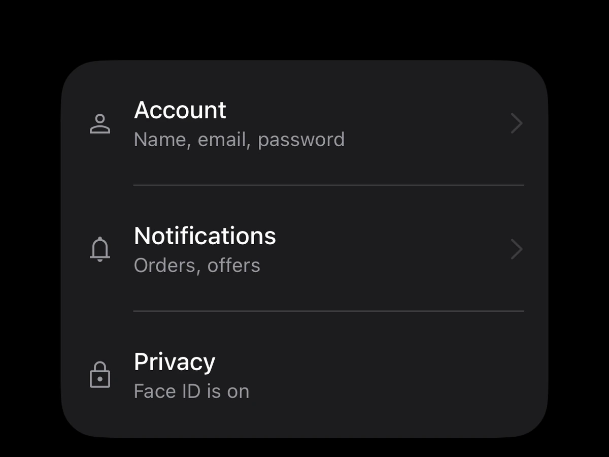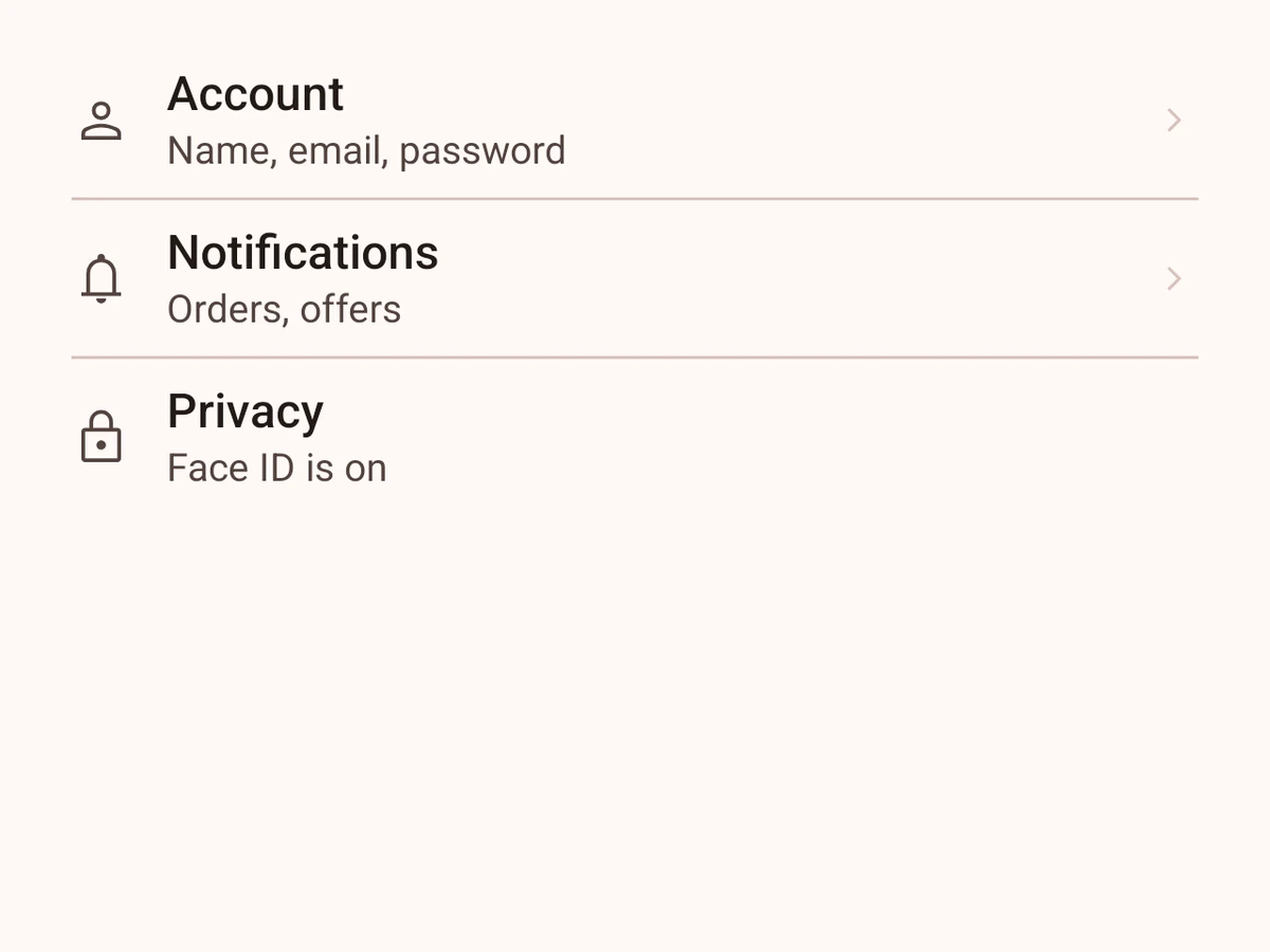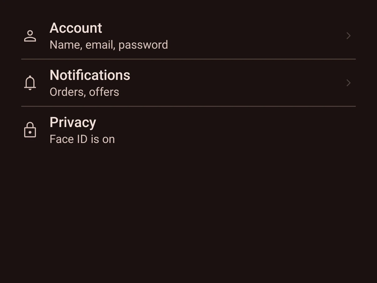


Content
Text
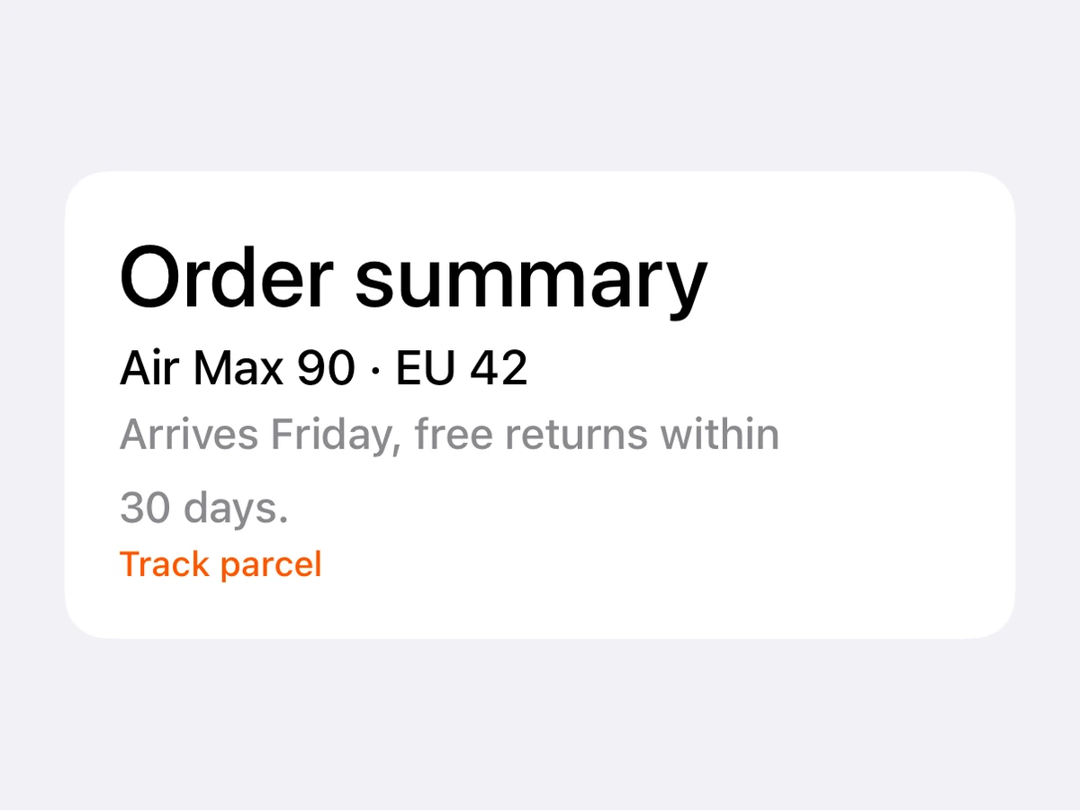
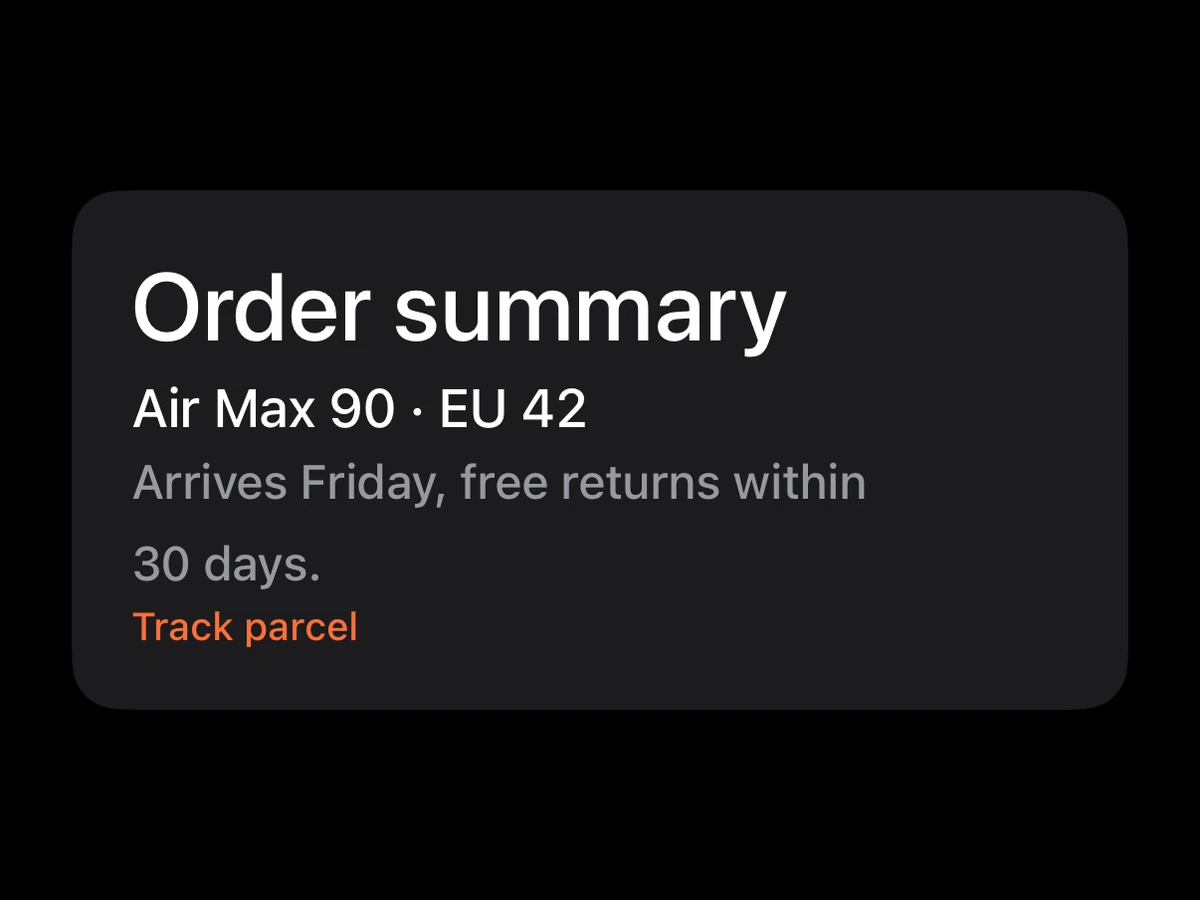
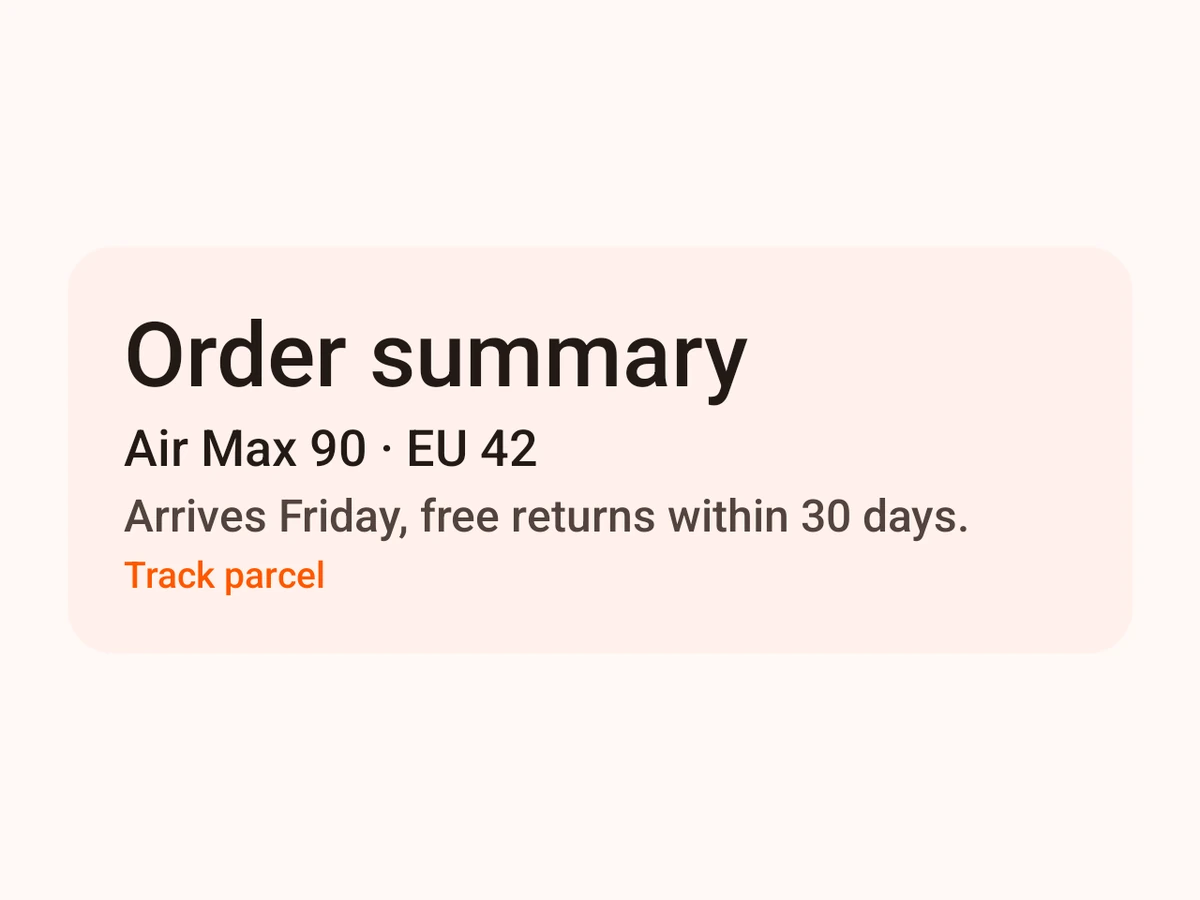
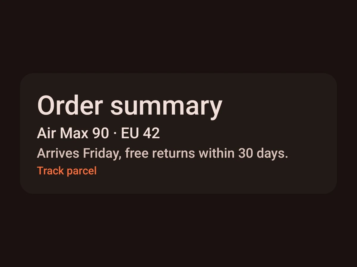
Text in the type scale, coloured by token.
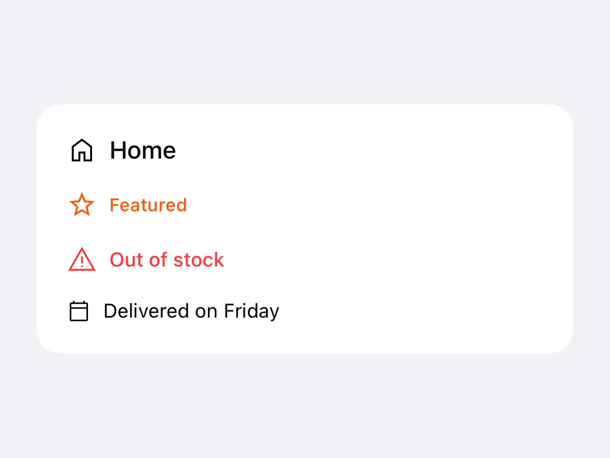
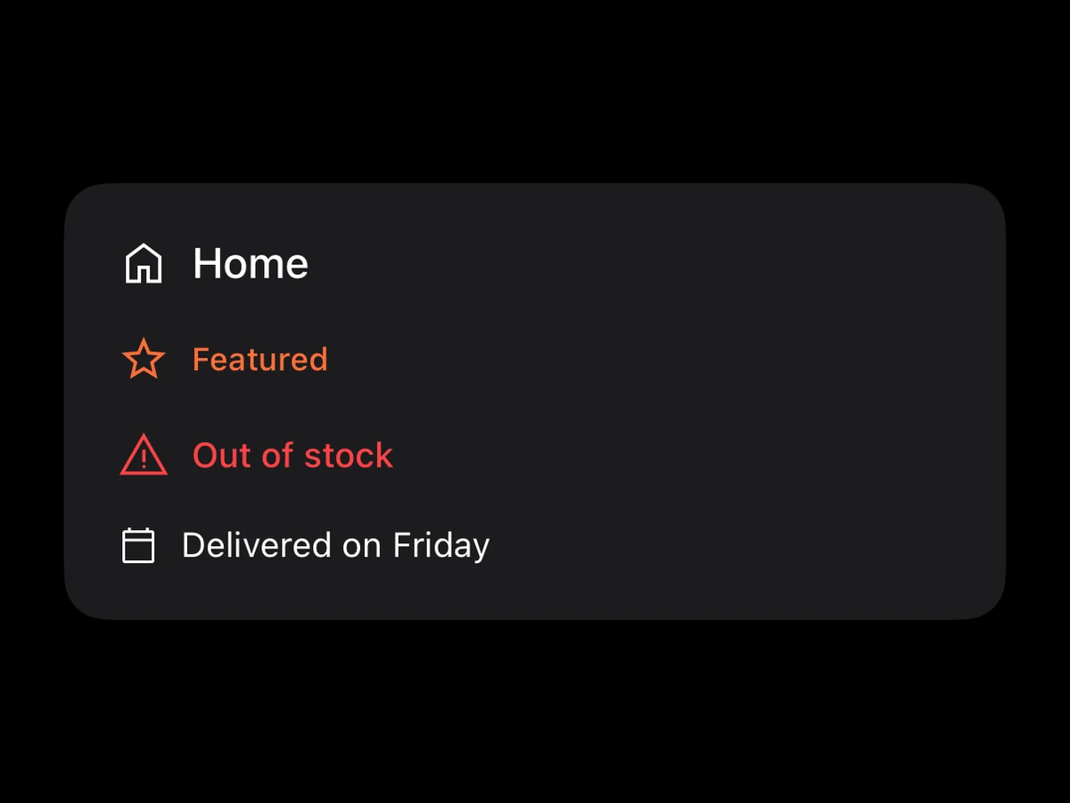
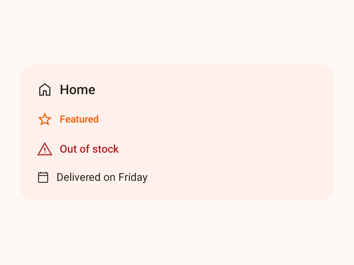
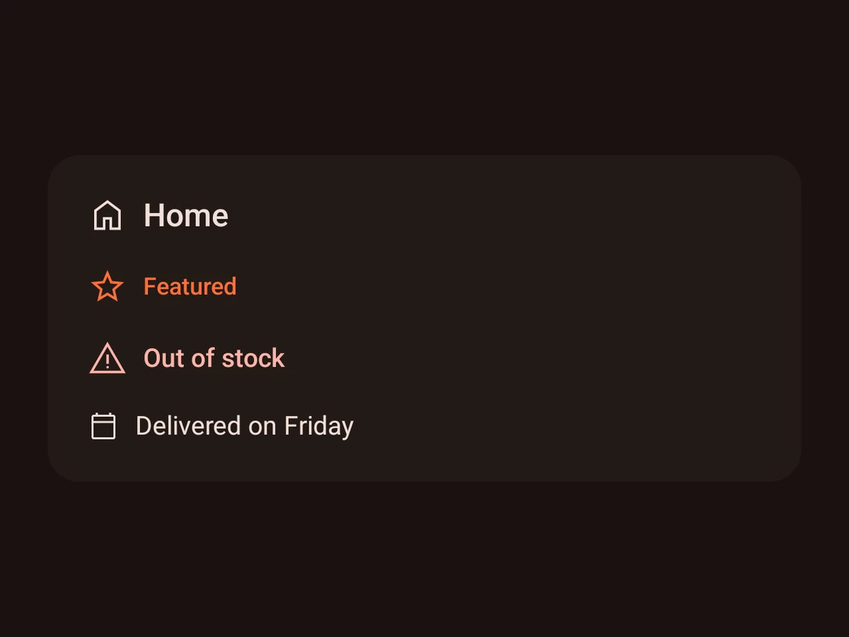
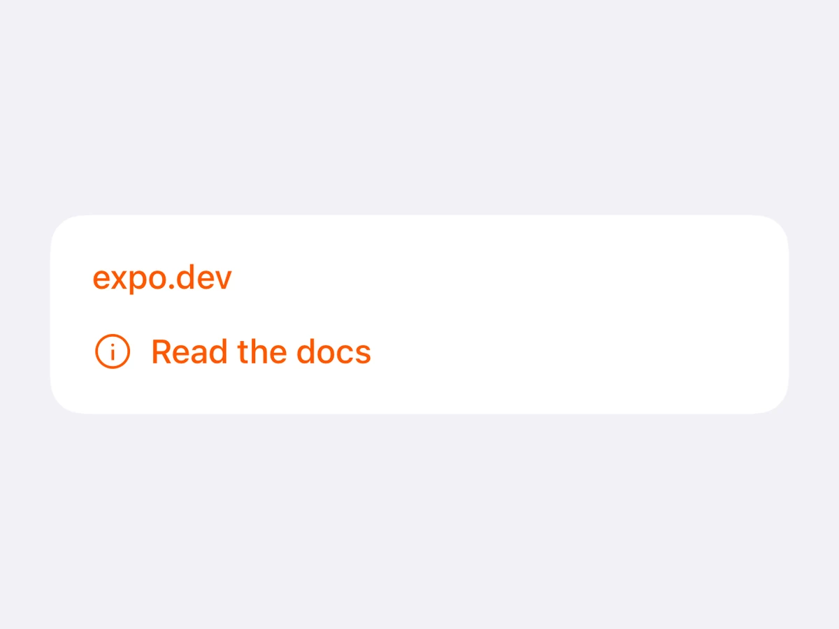
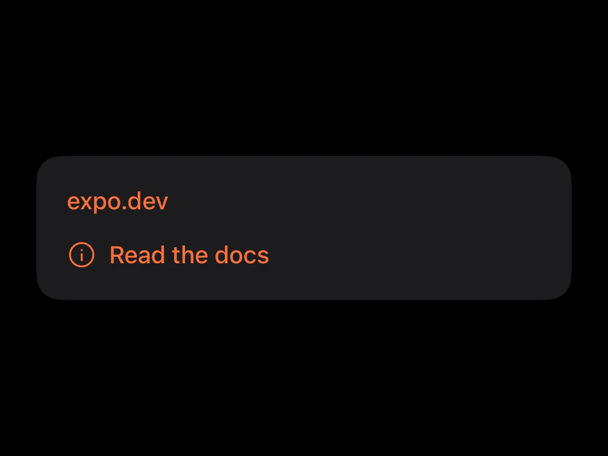
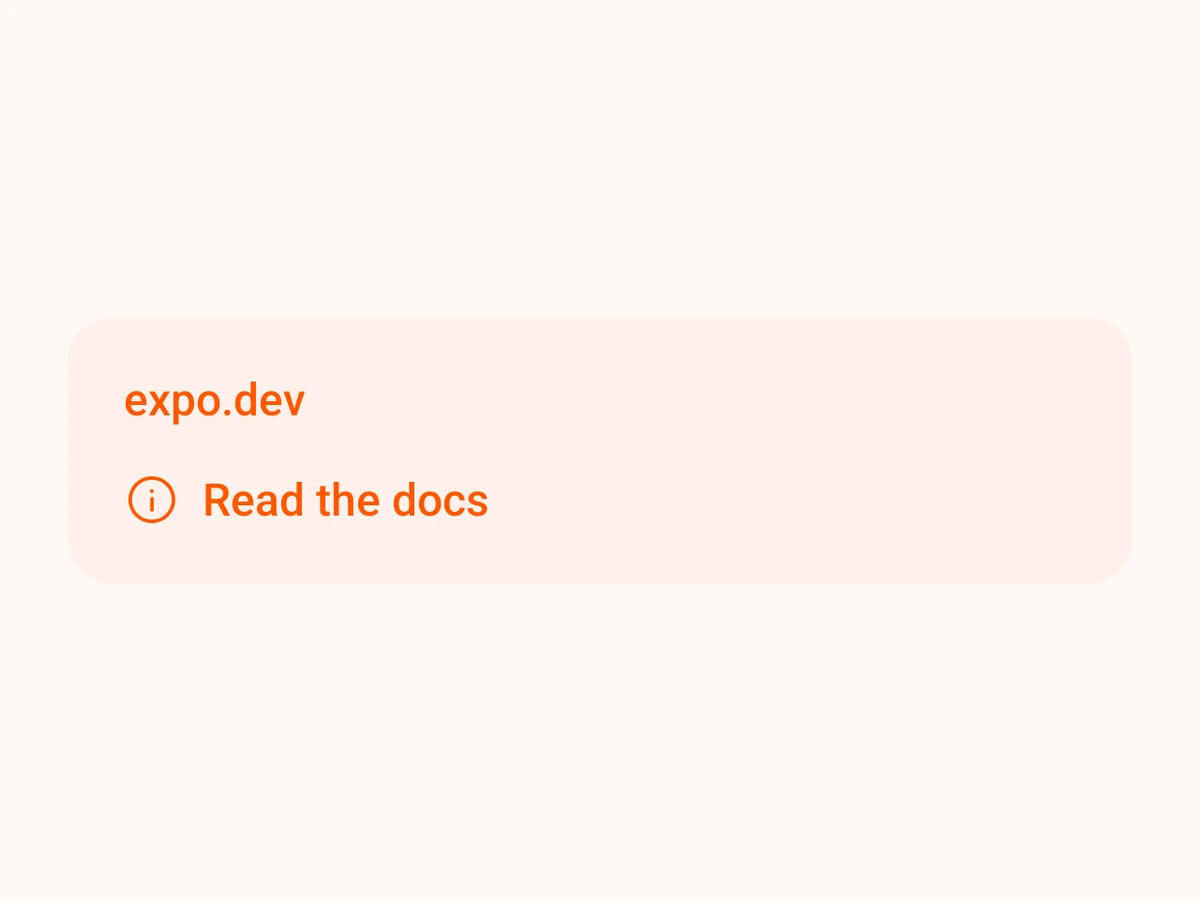
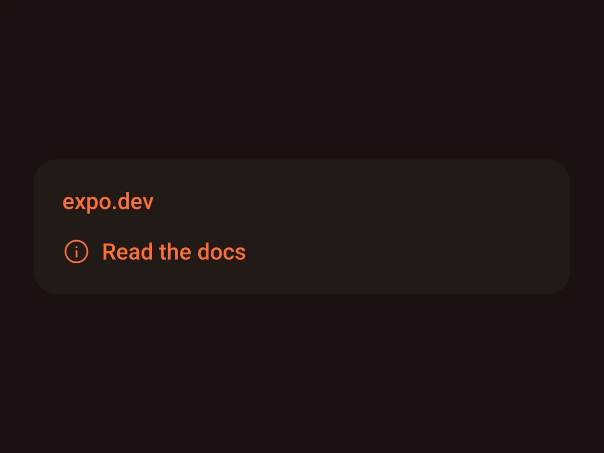
Label
An icon and a short text, aligned.
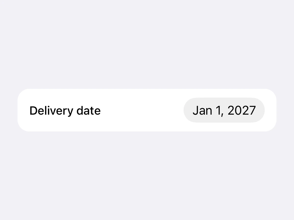
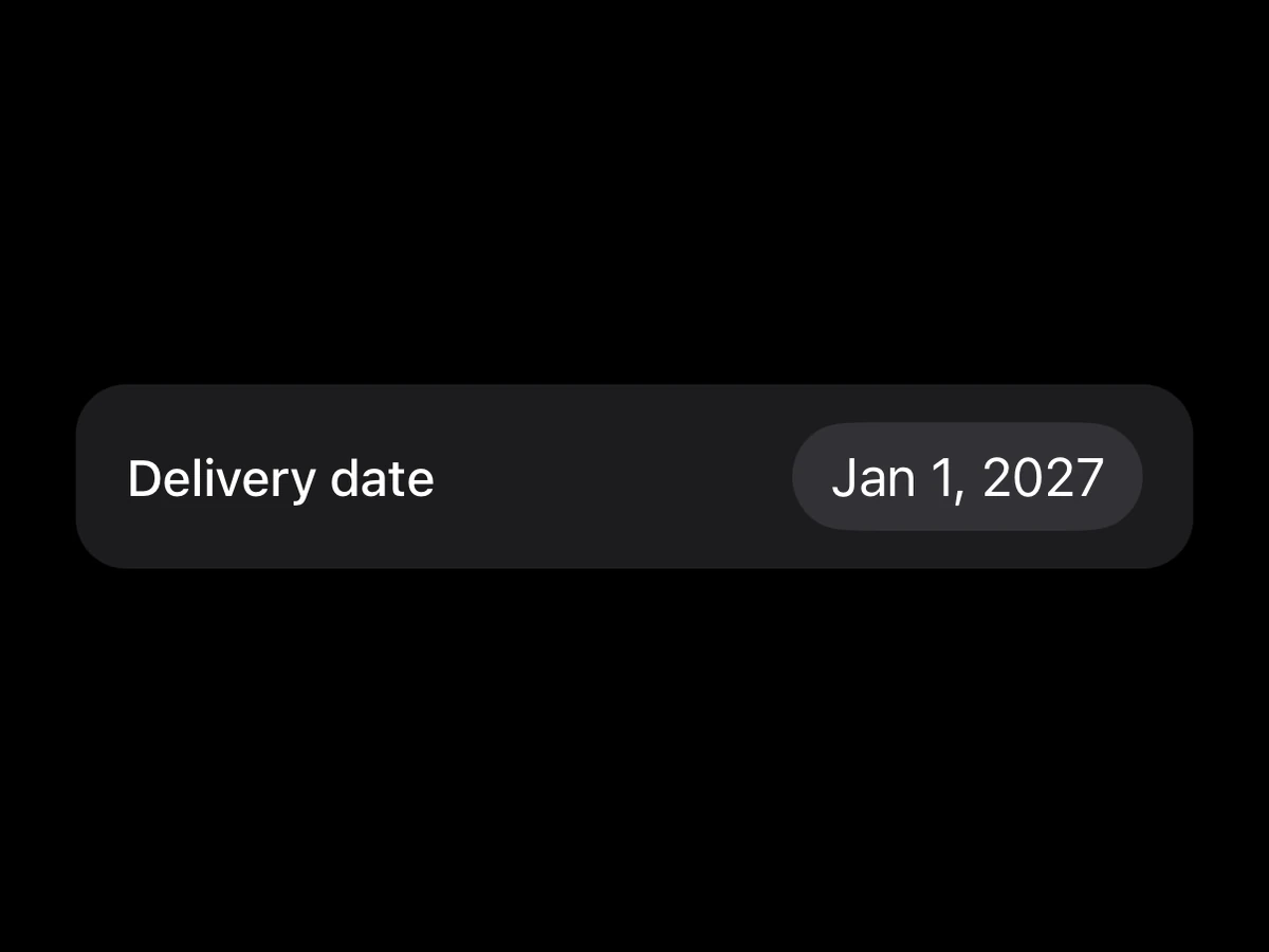
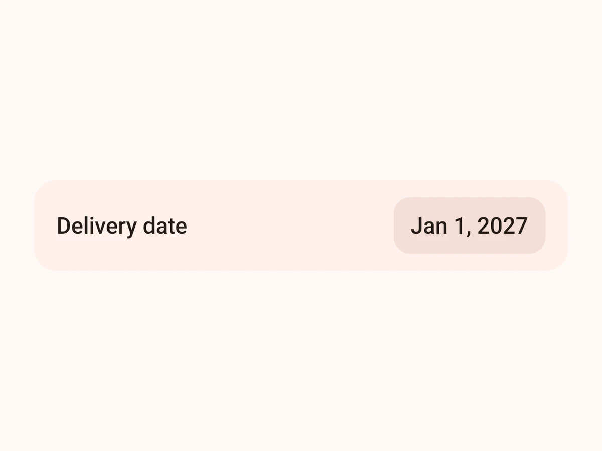
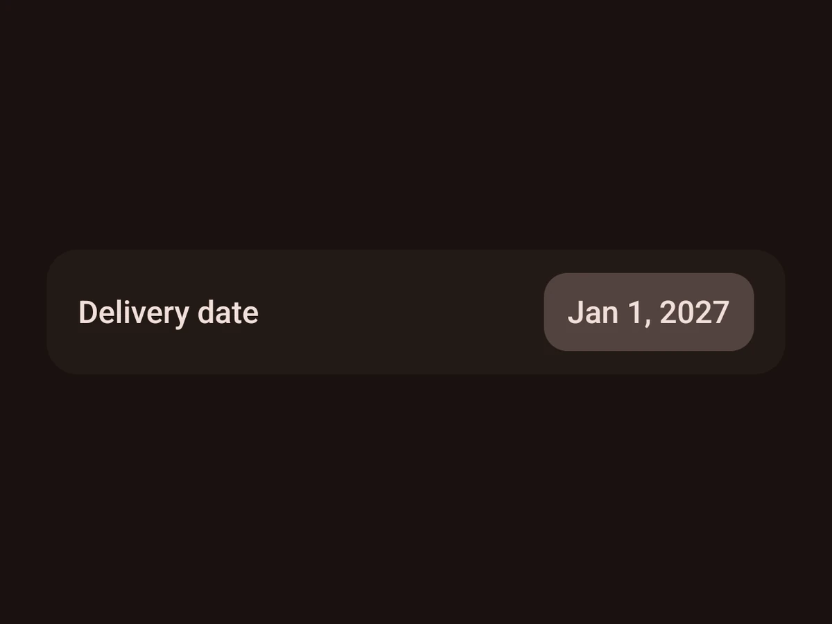
LabeledContent
A label with a value or a control beside it.
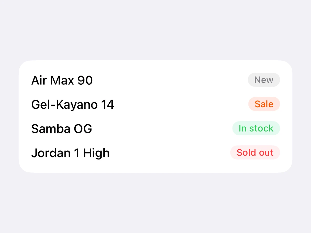
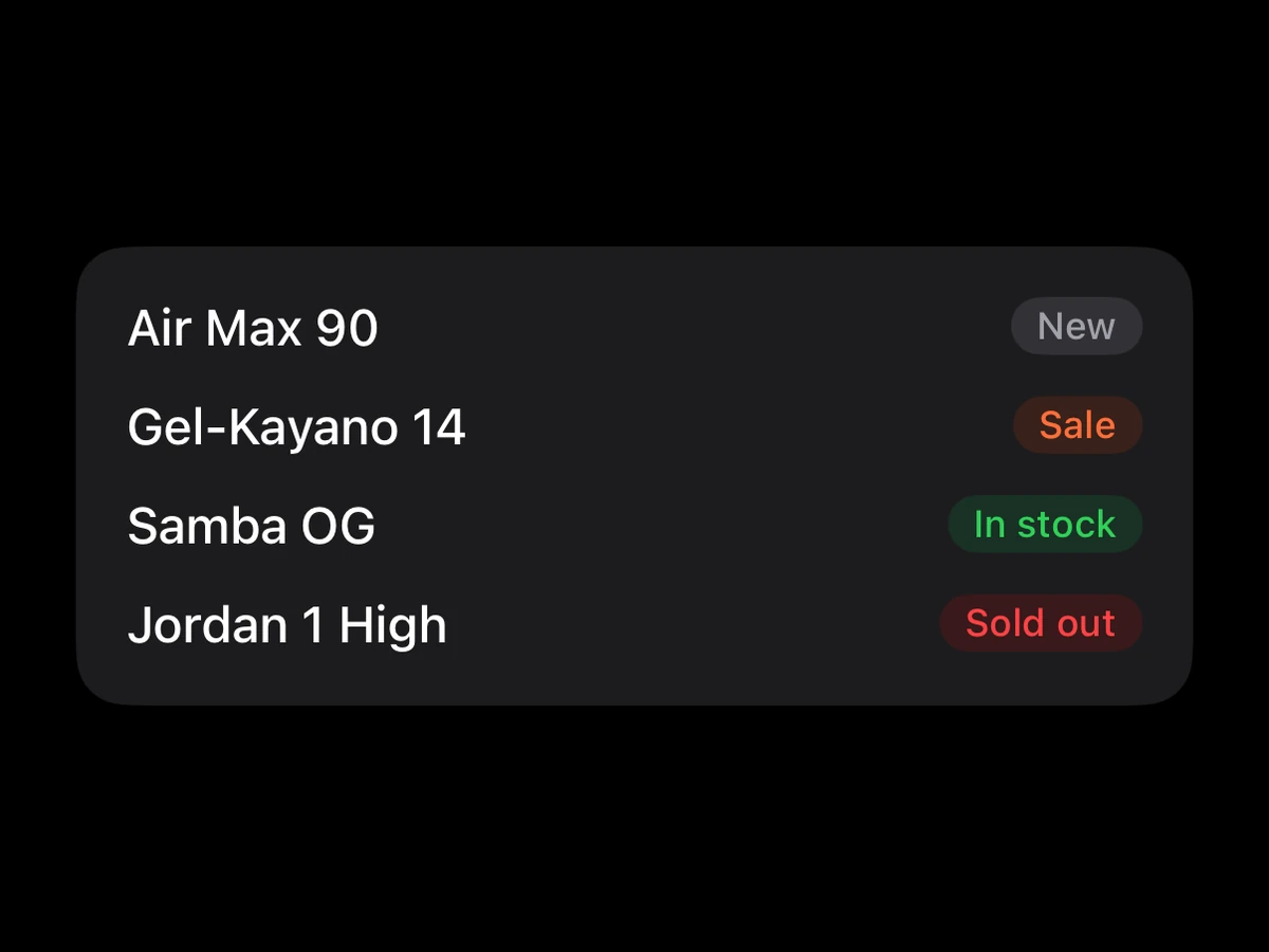
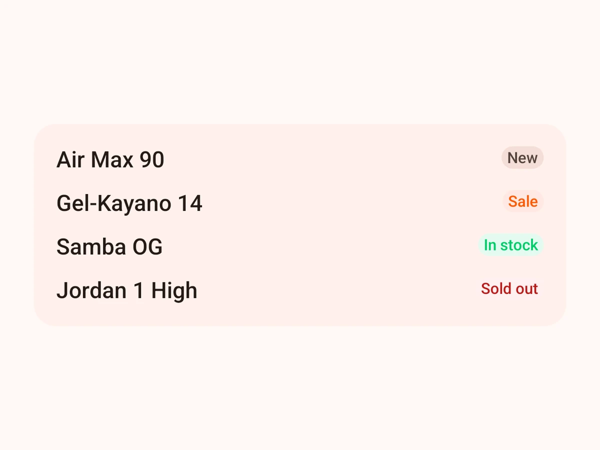
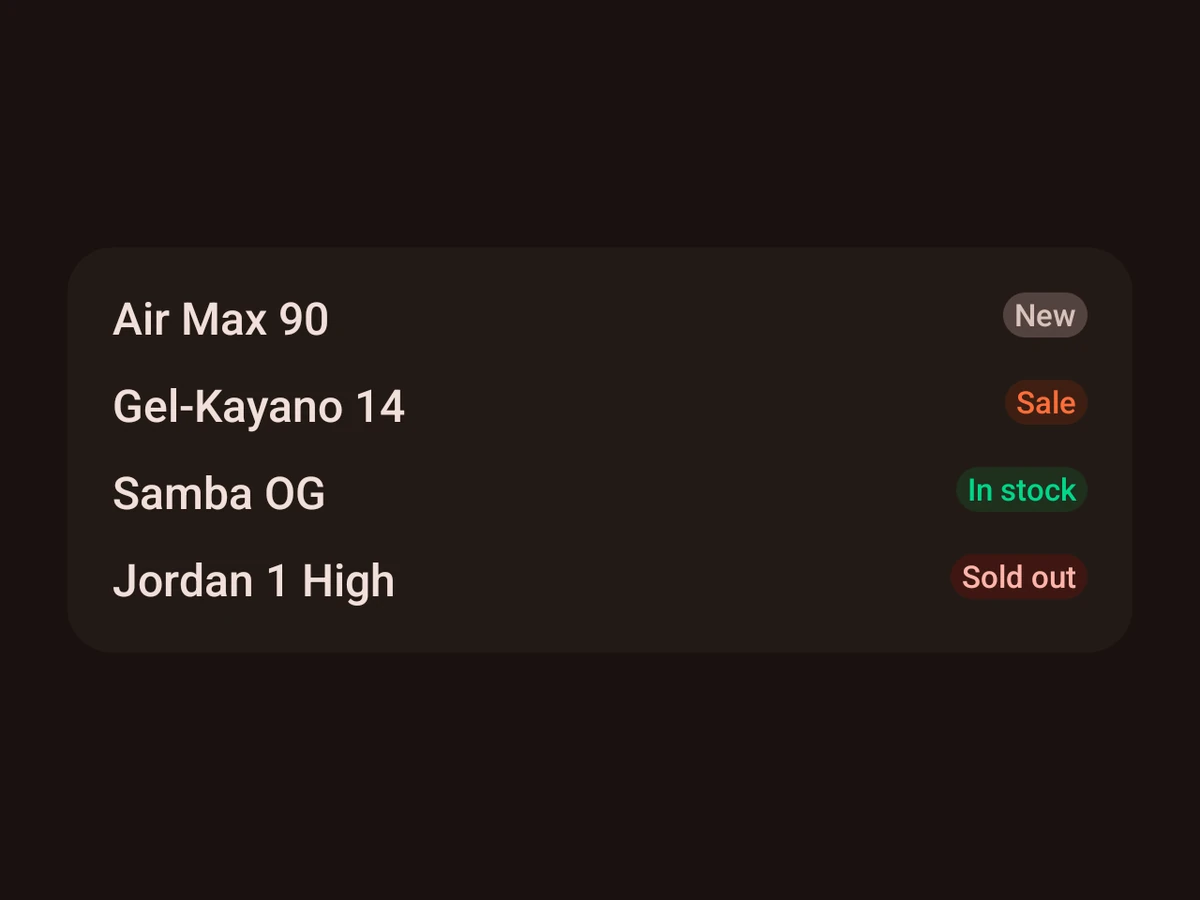
Badge
A small status label.
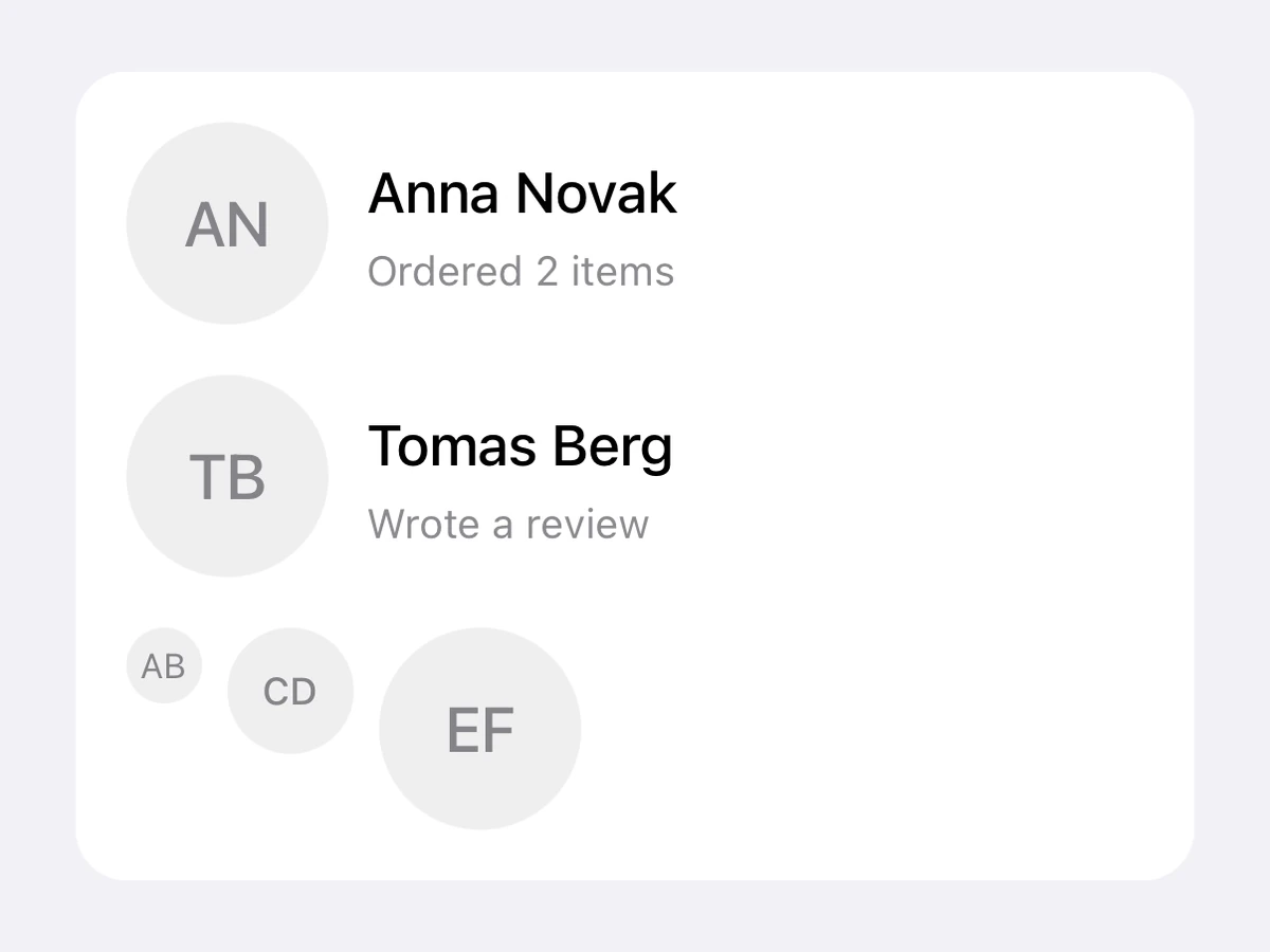
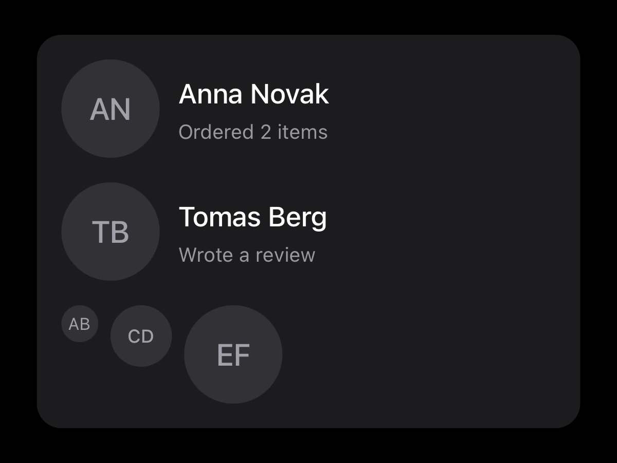
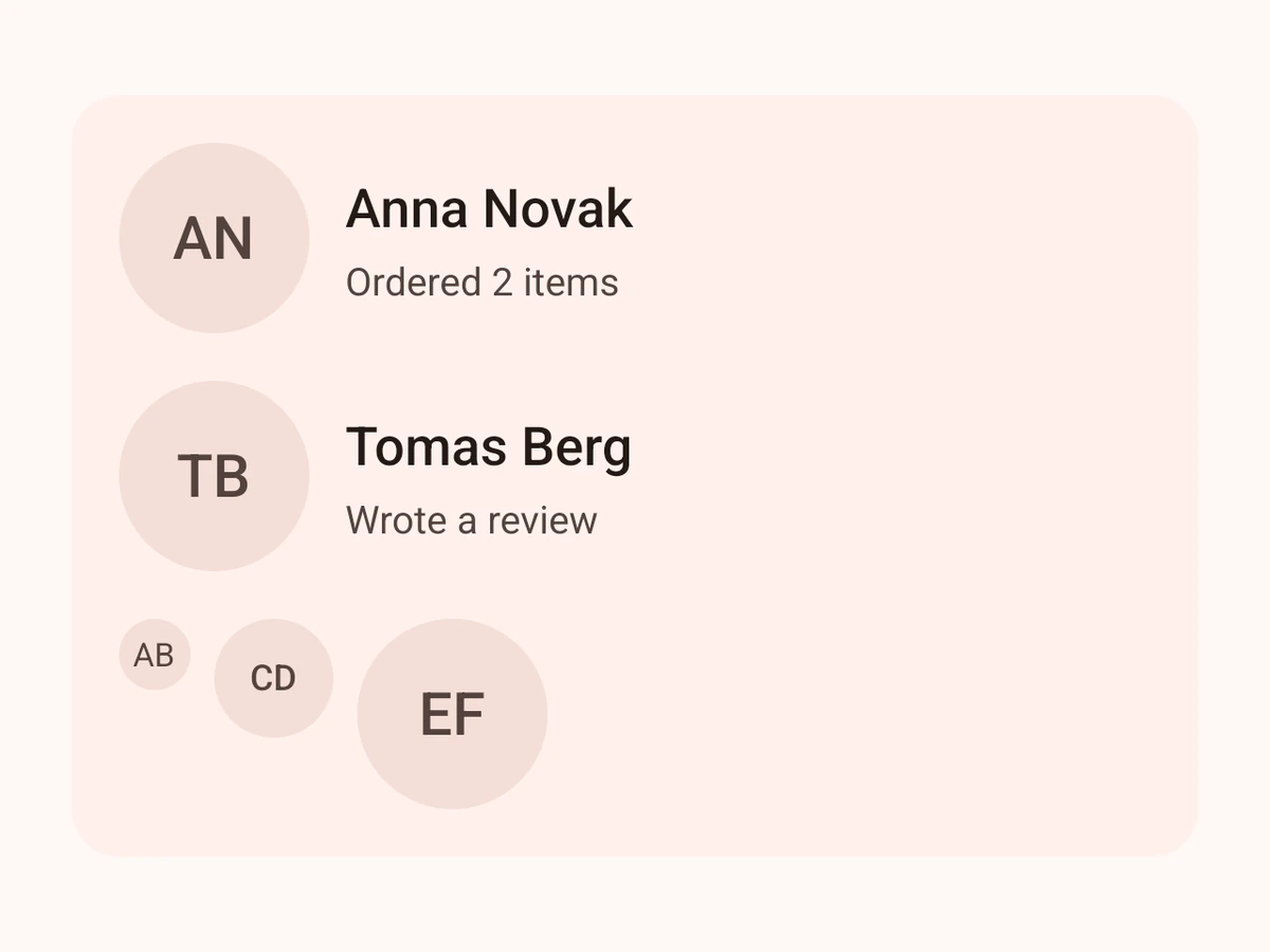
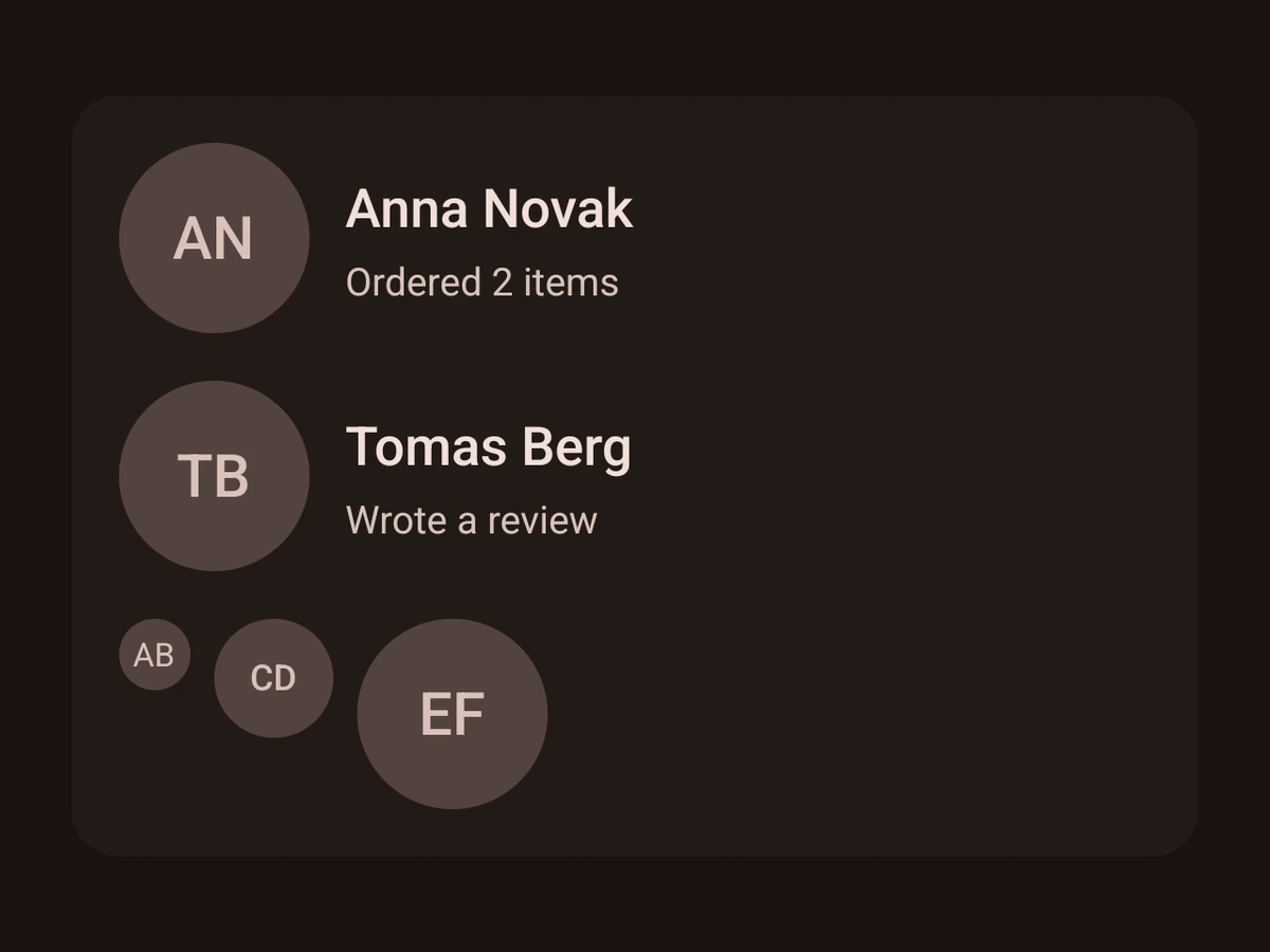
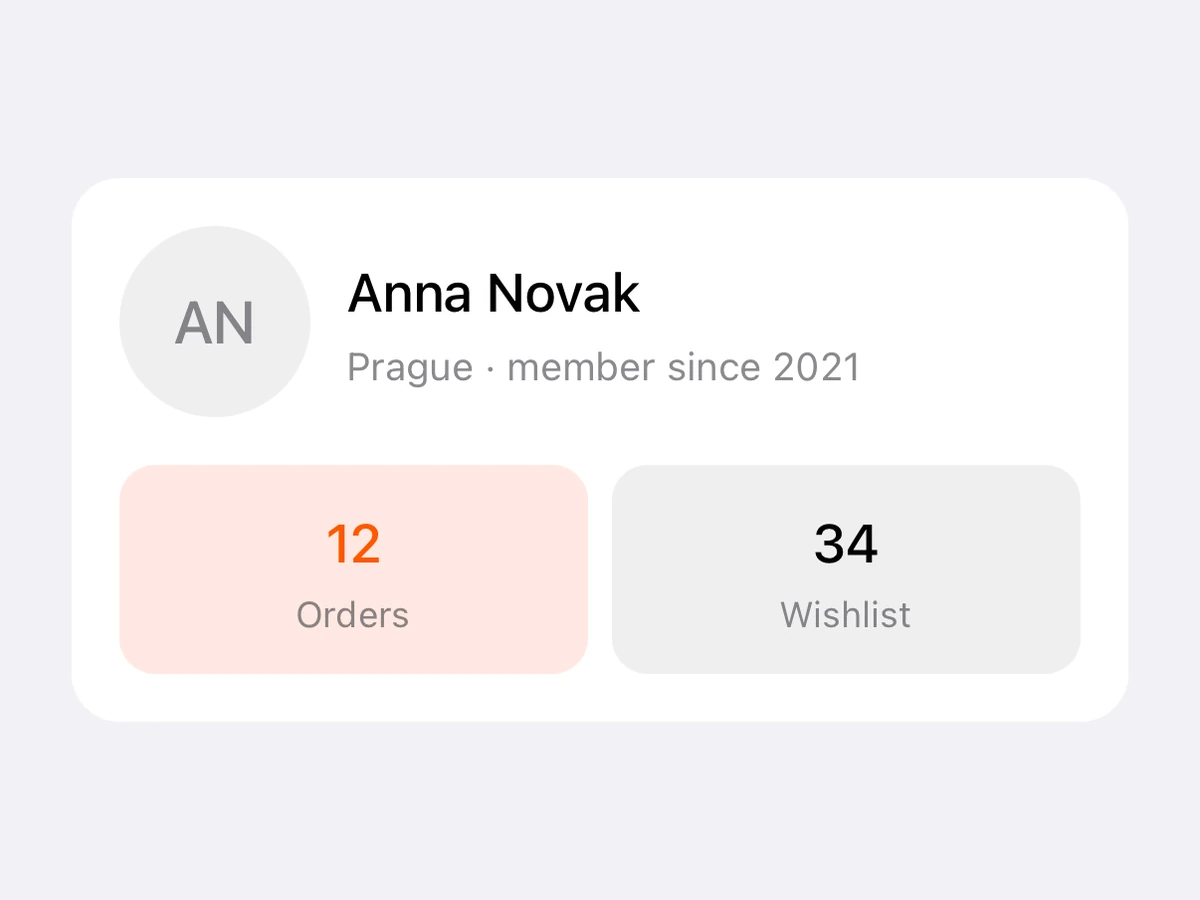
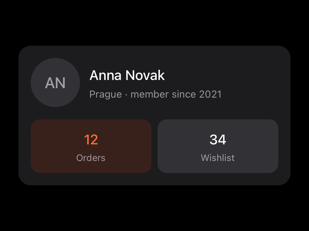
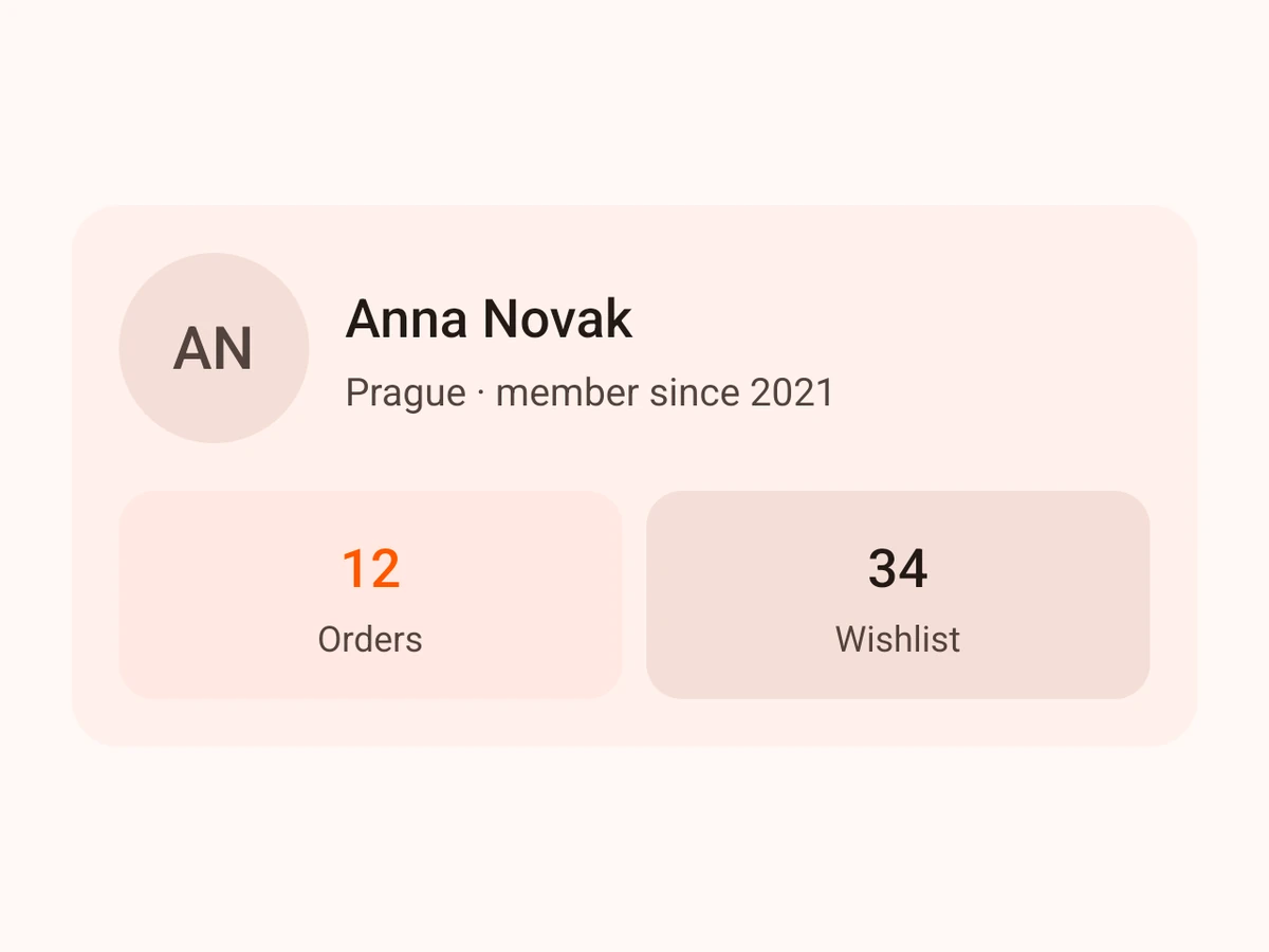
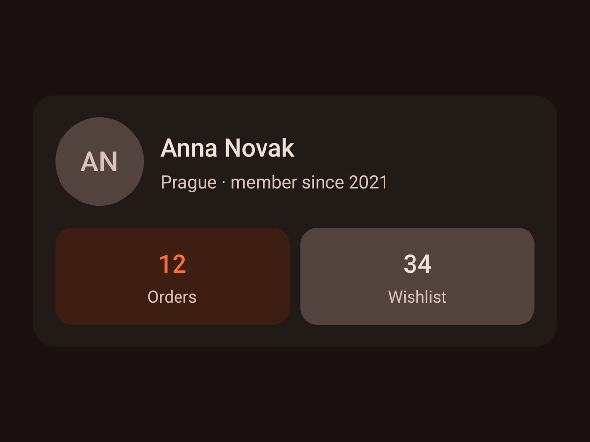
Avatar
A person’s initials or photo in a circle.
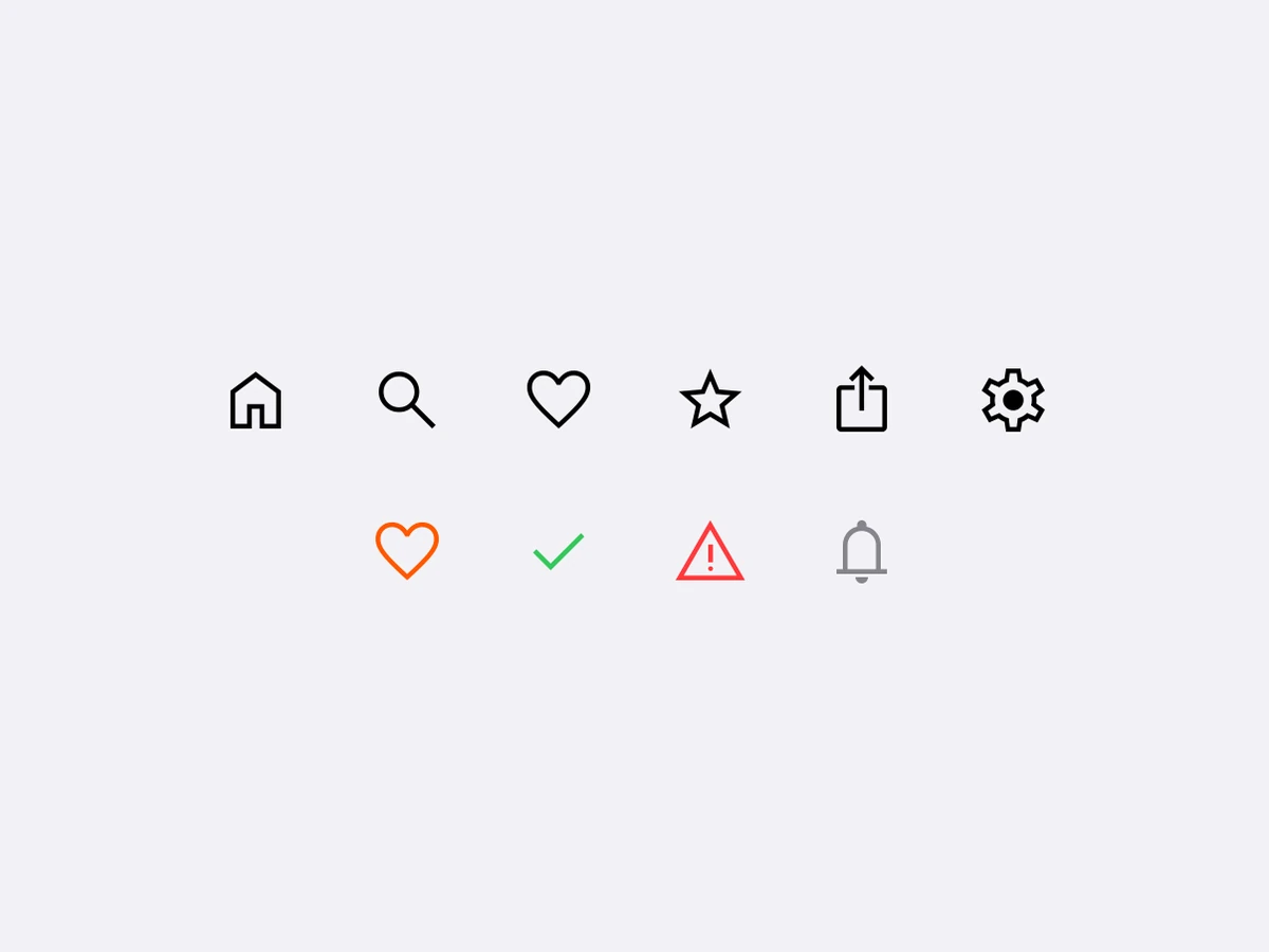
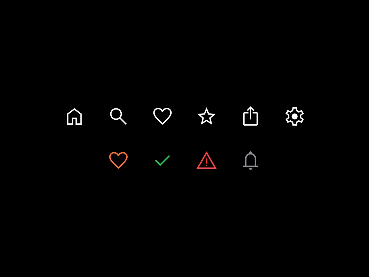
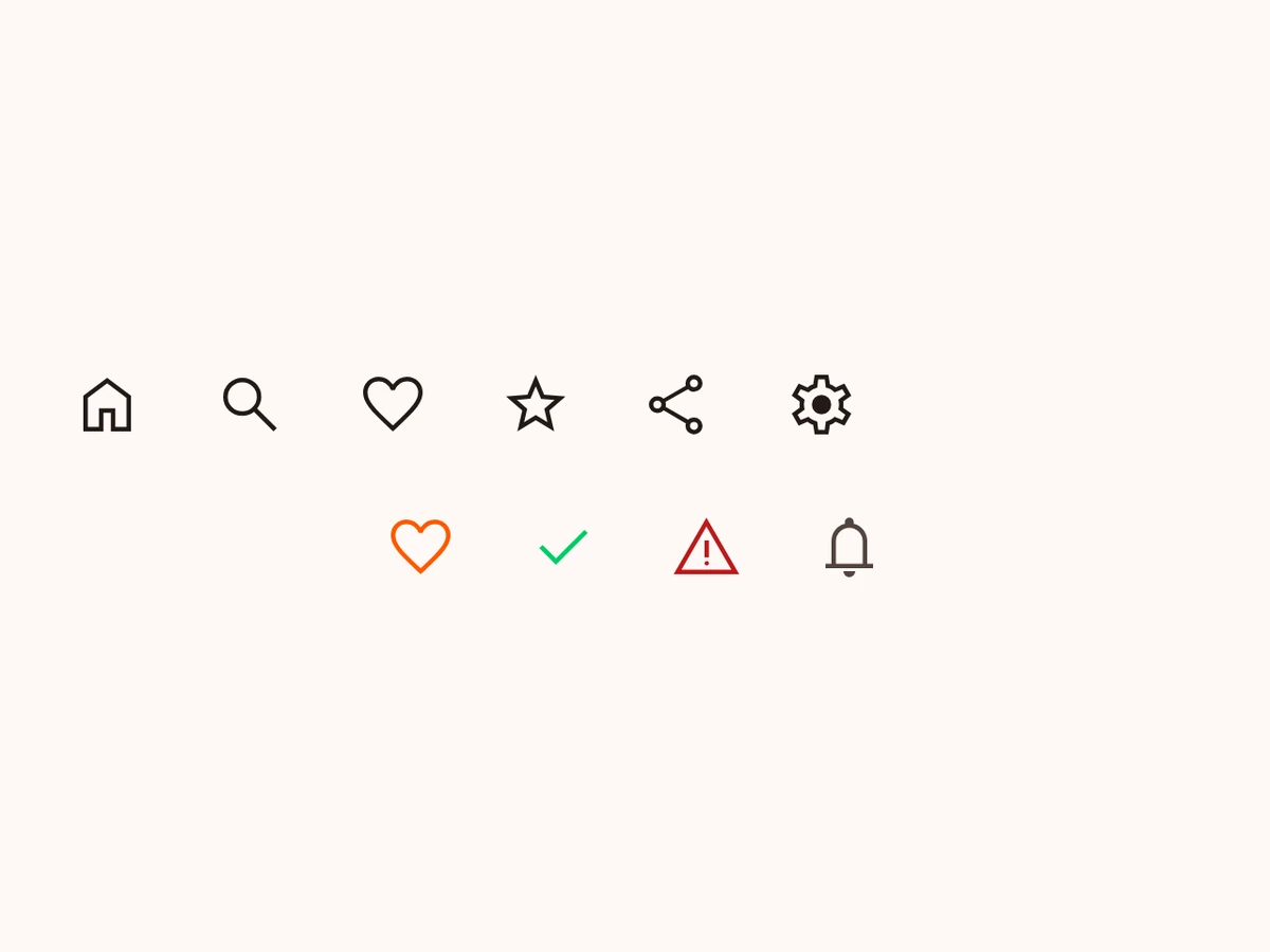
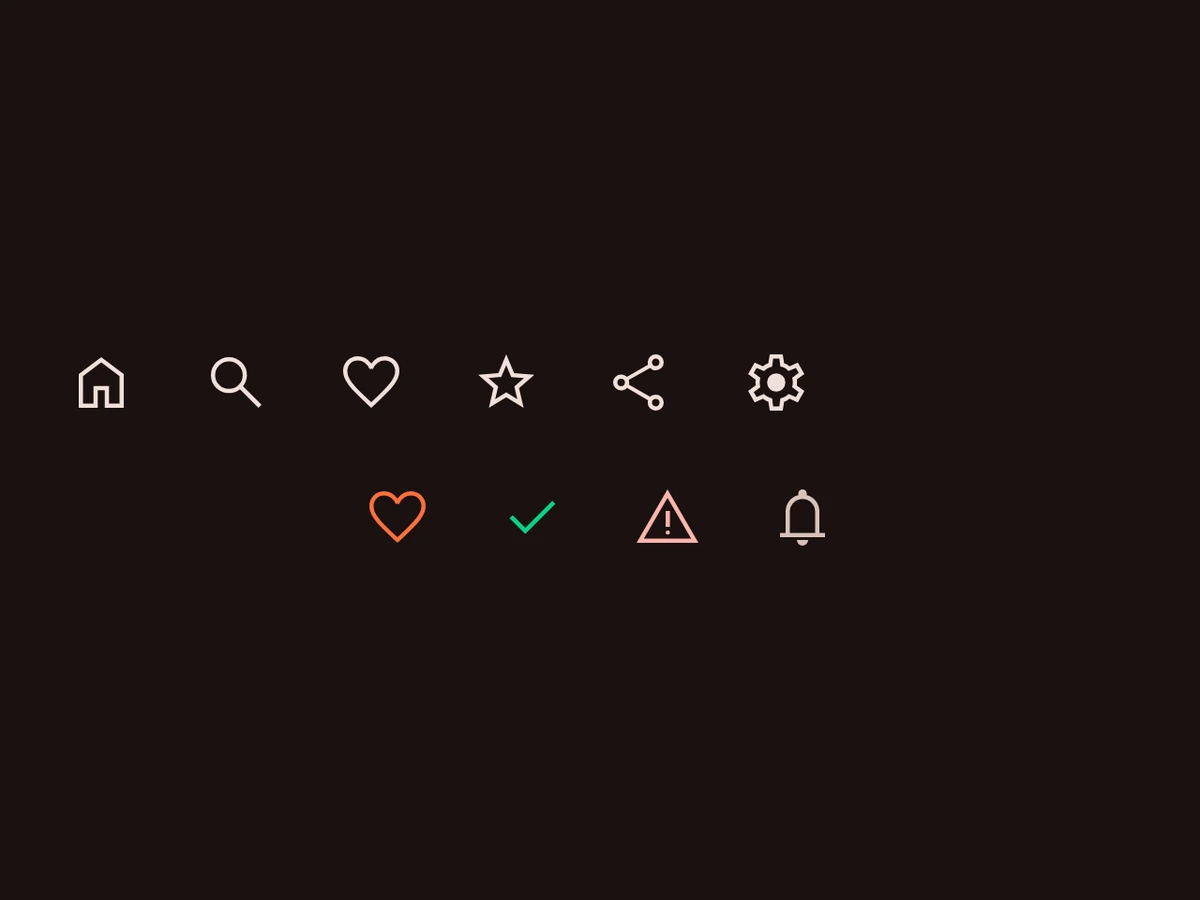
Icon
Your own SVG icons, drawn natively in both tiers.




Image
A remote or local image that fades in.
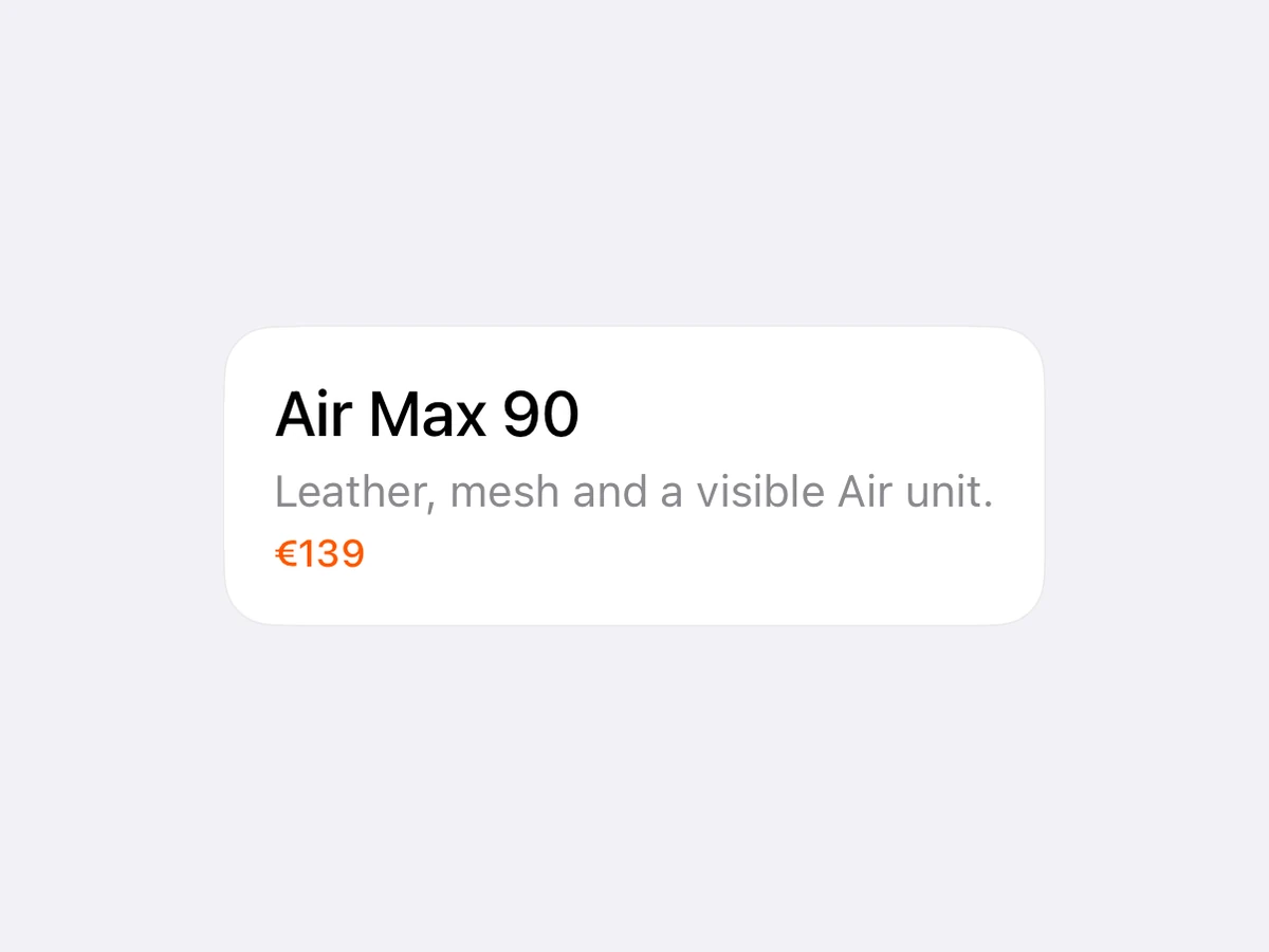
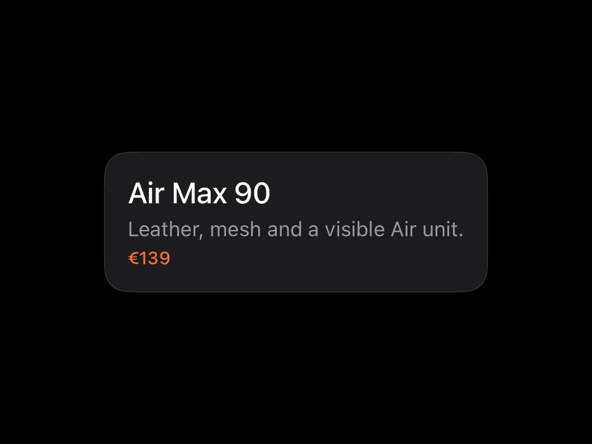
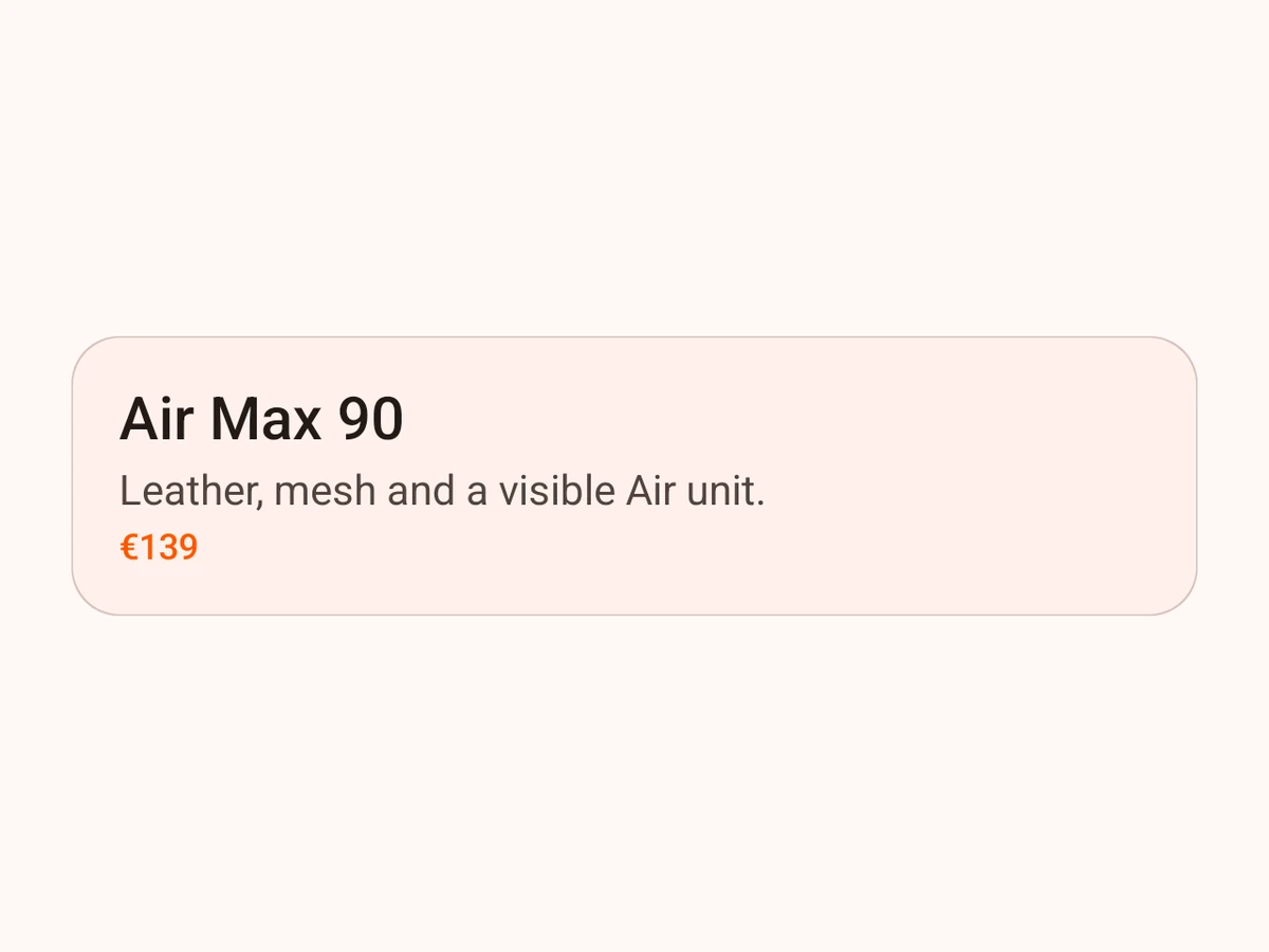
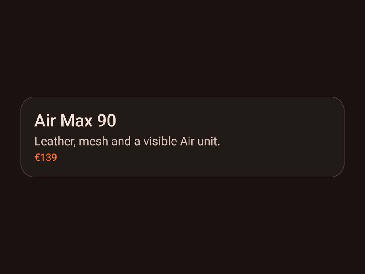
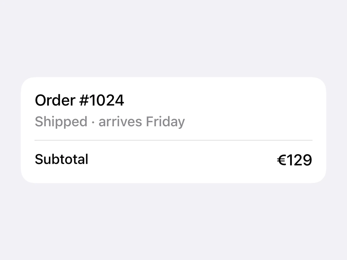
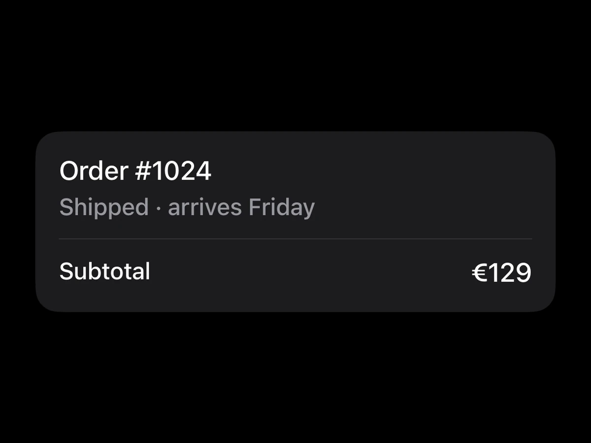
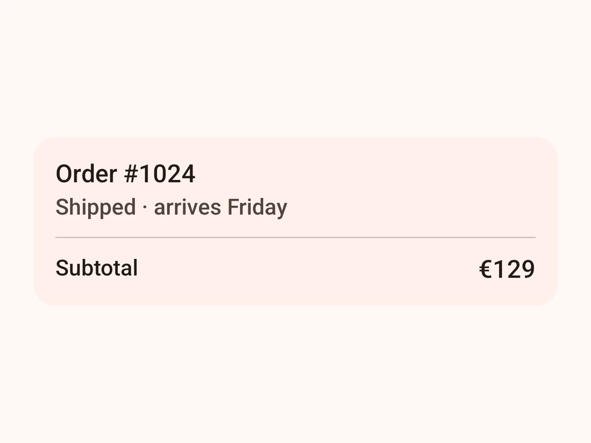
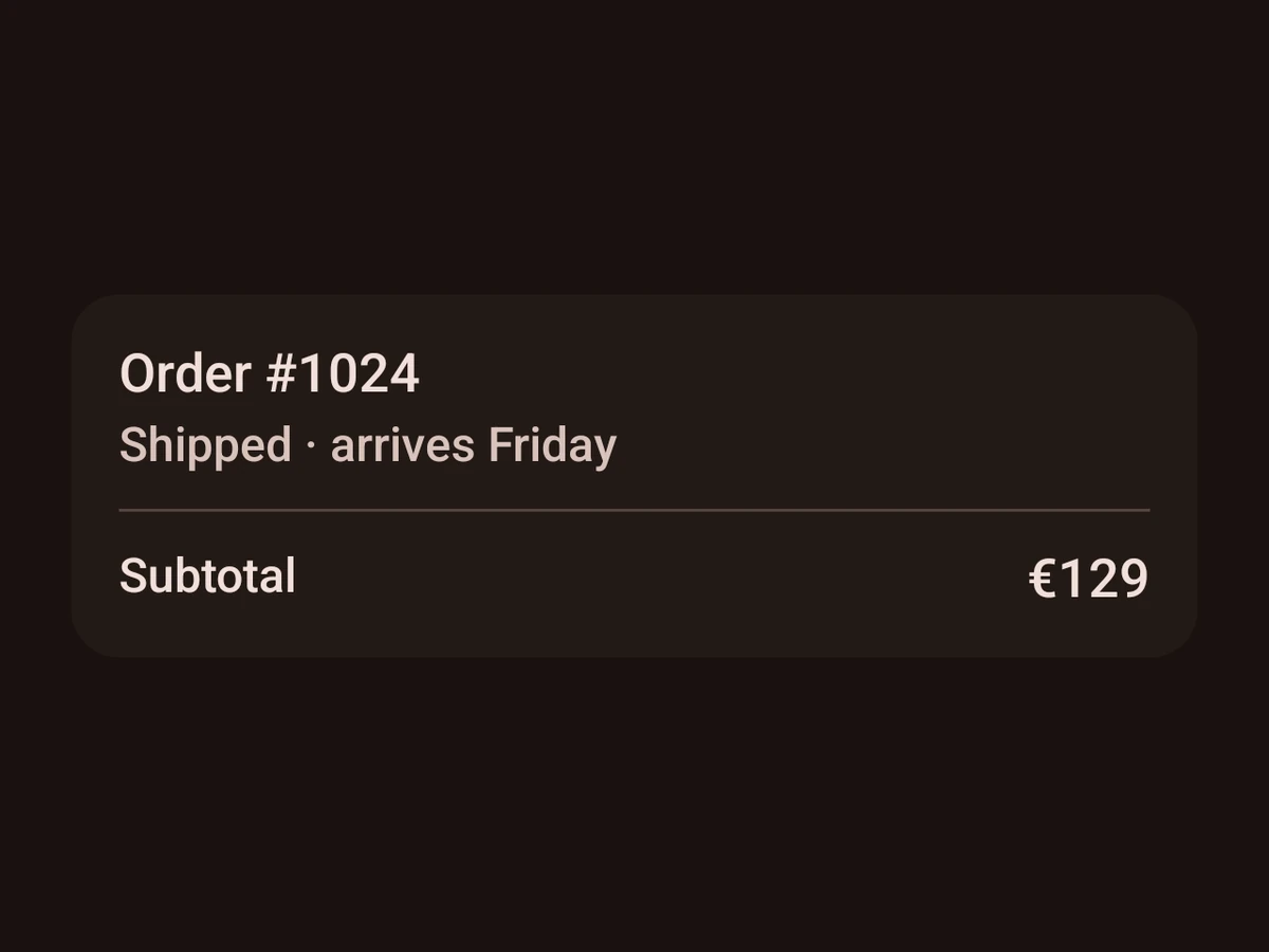
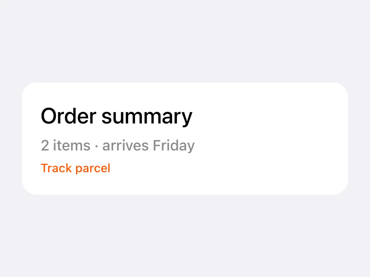
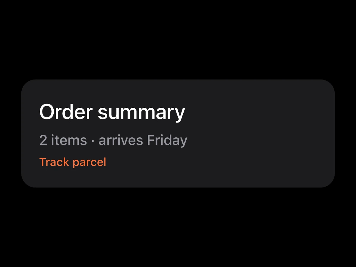
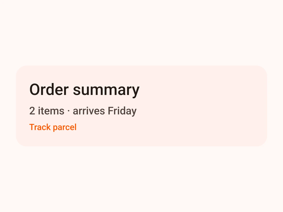
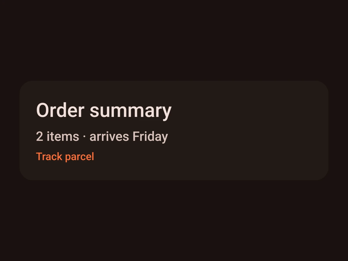
Card
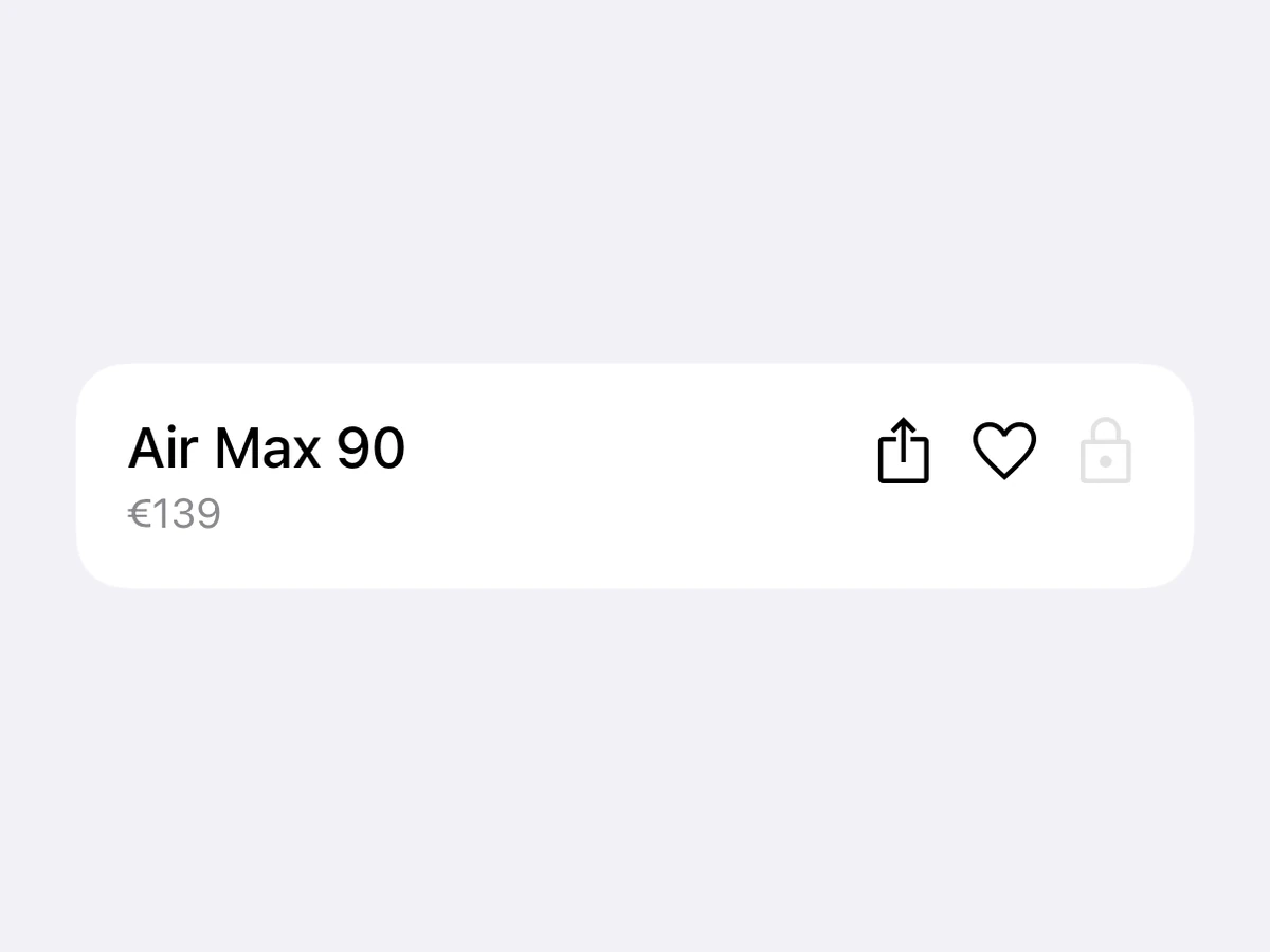
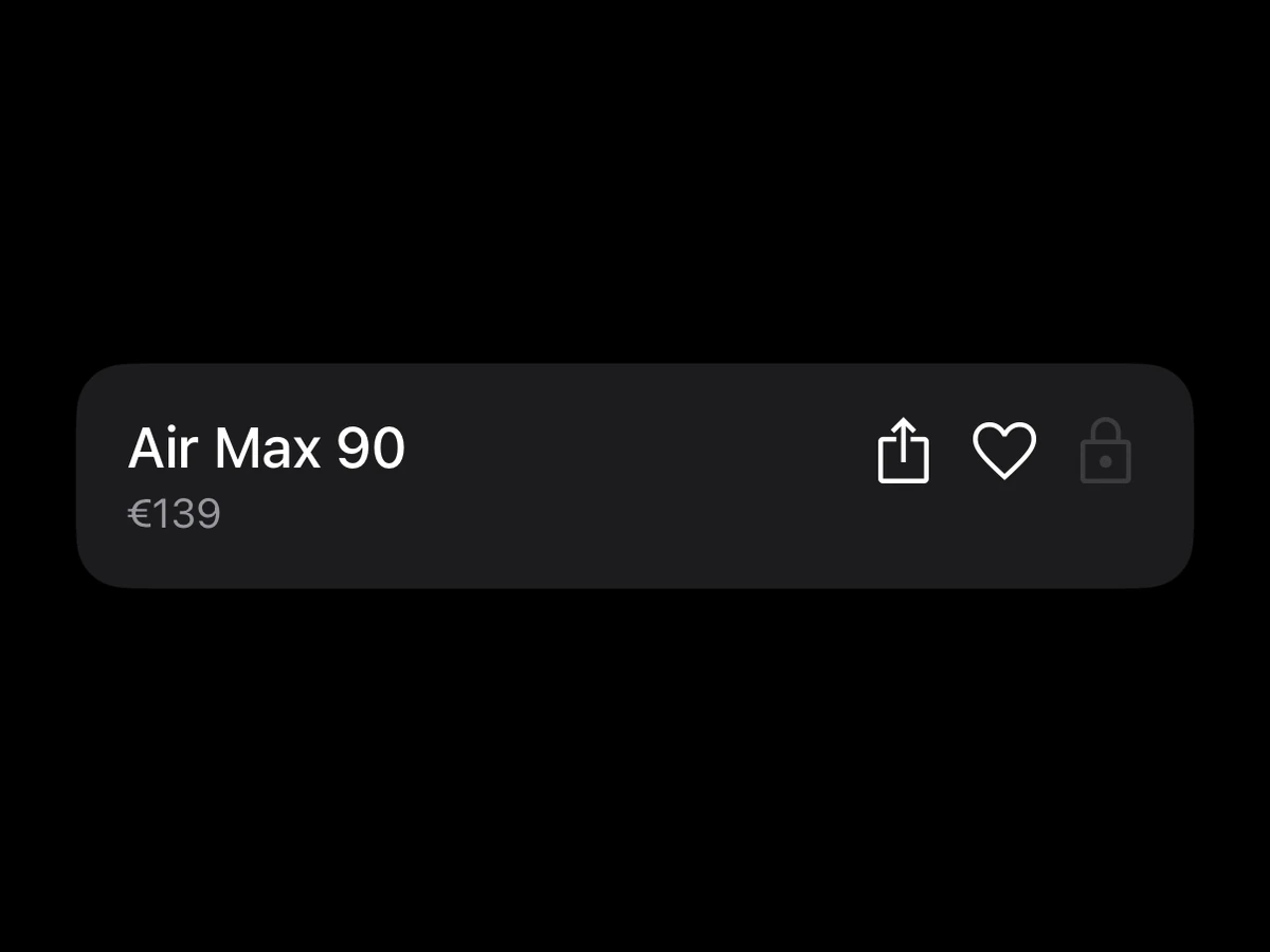
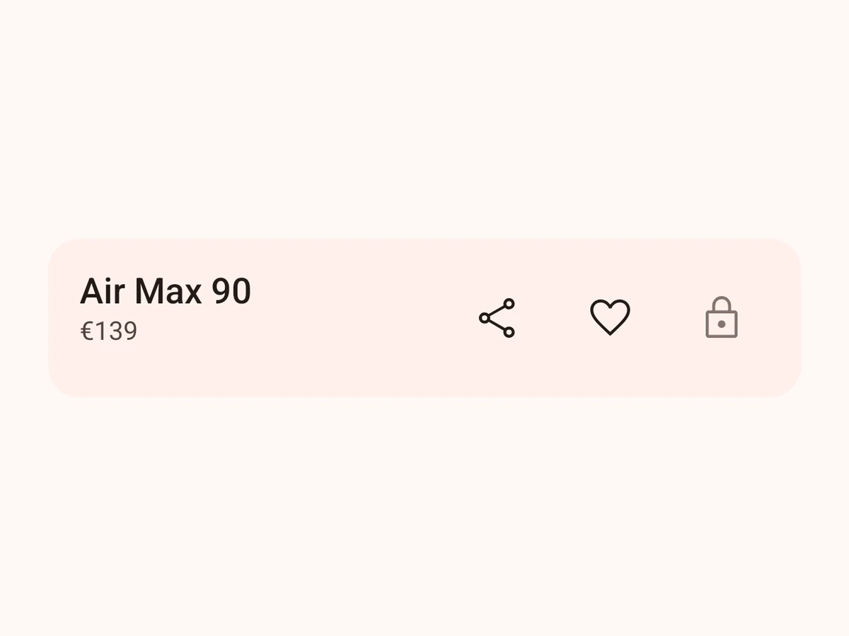
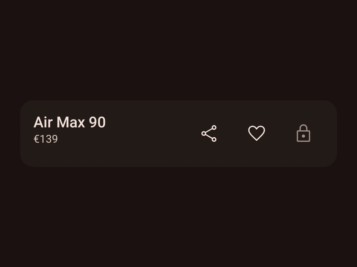
A raised container for one piece of content.
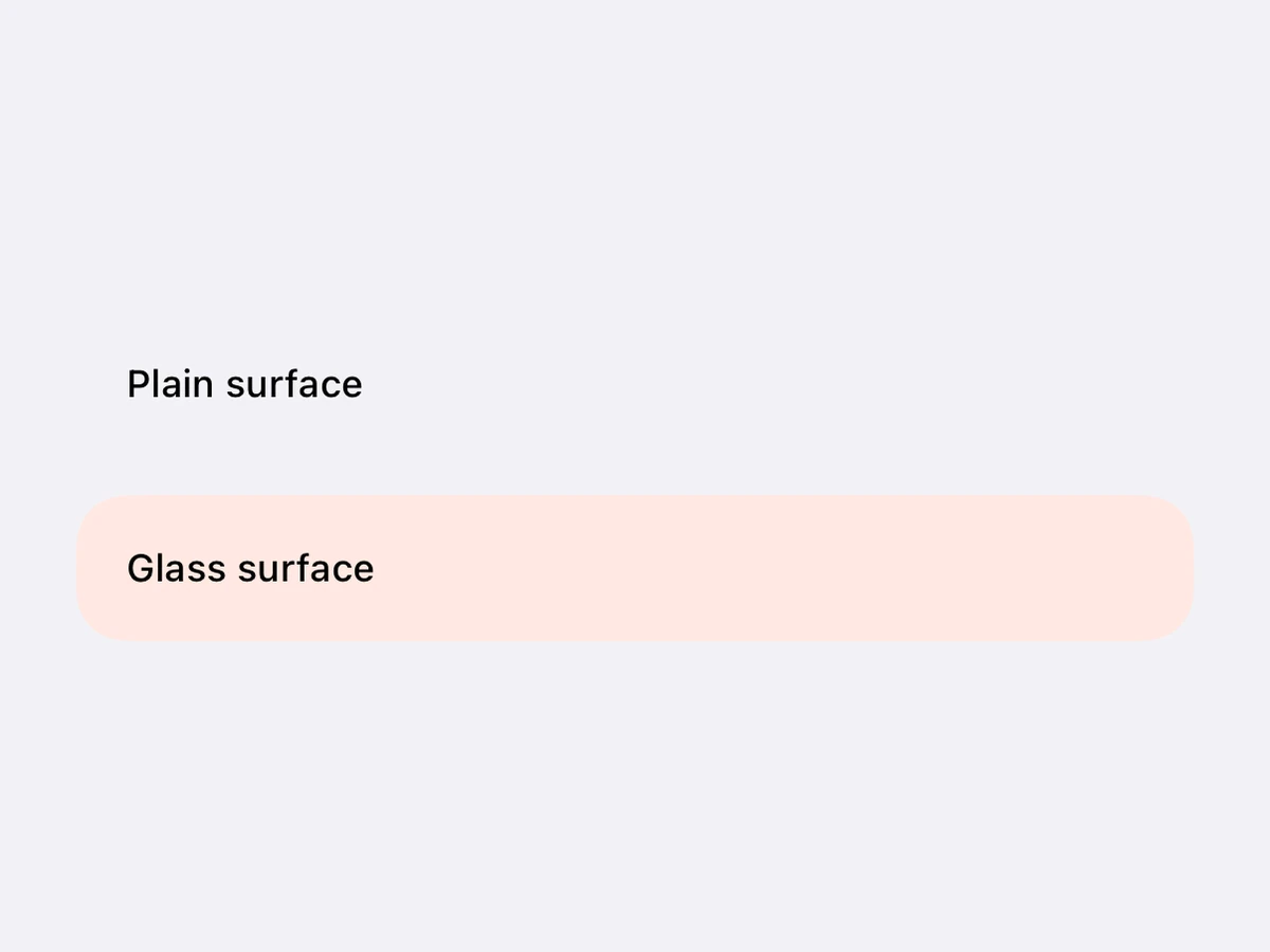
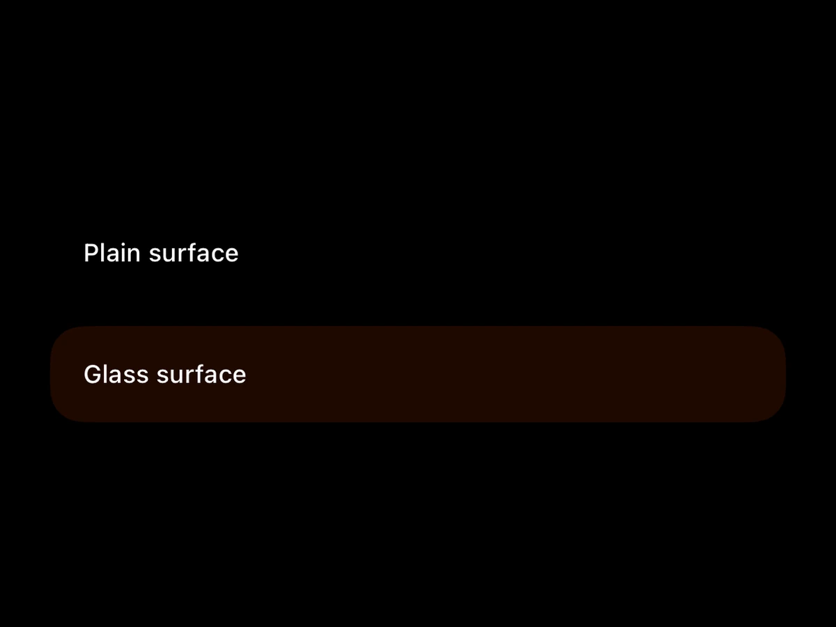
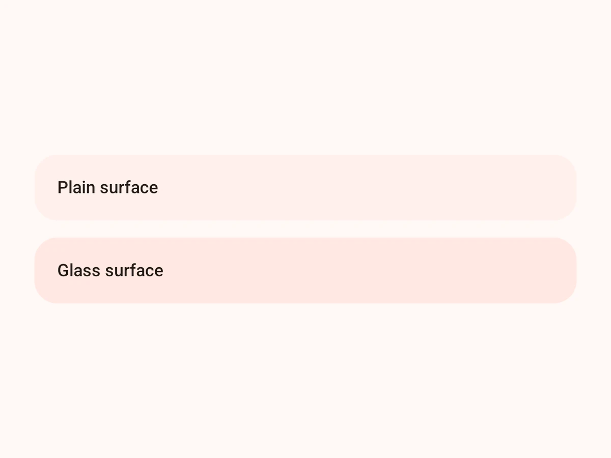
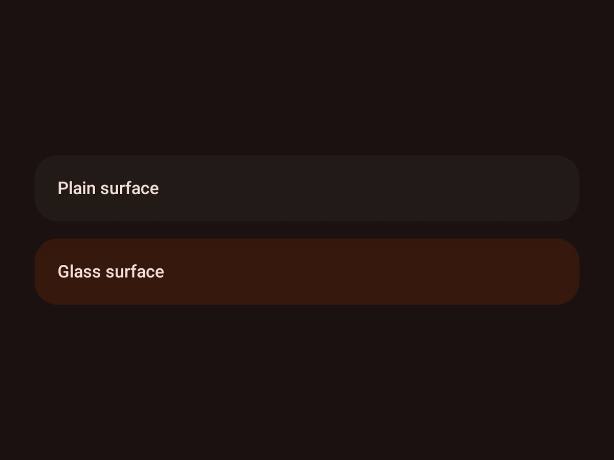
Surface
A coloured, rounded background — plain or glass.
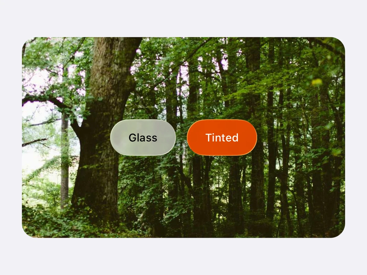
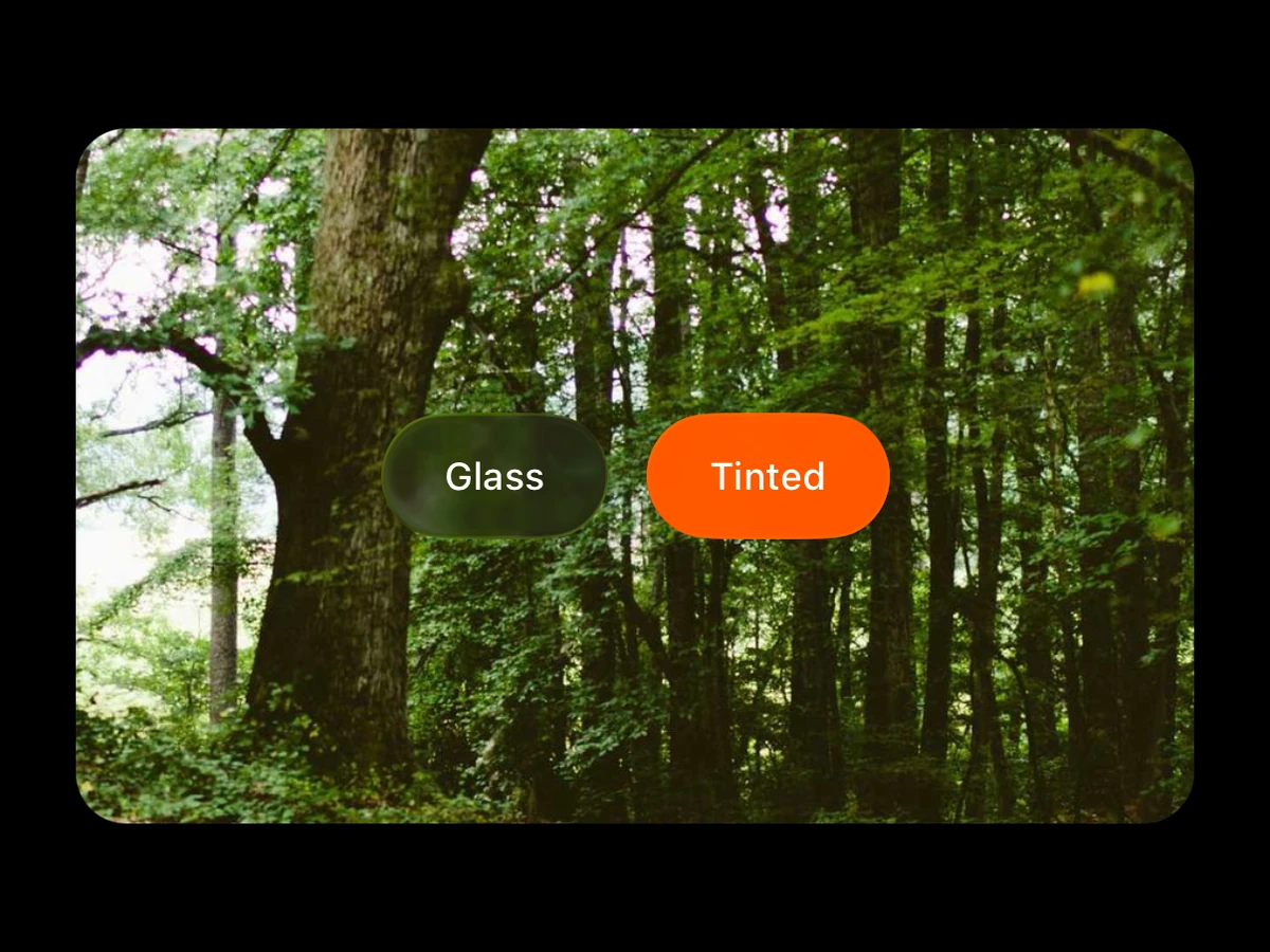
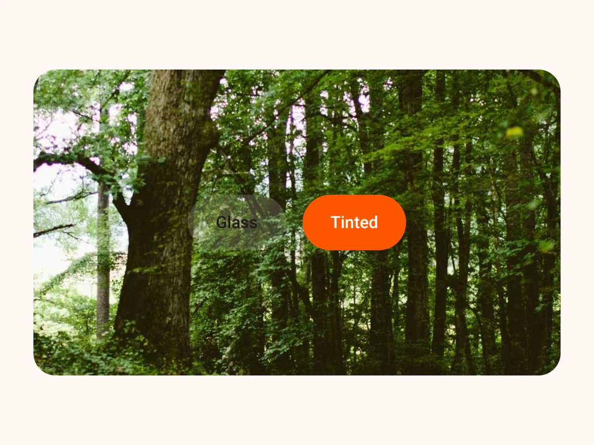
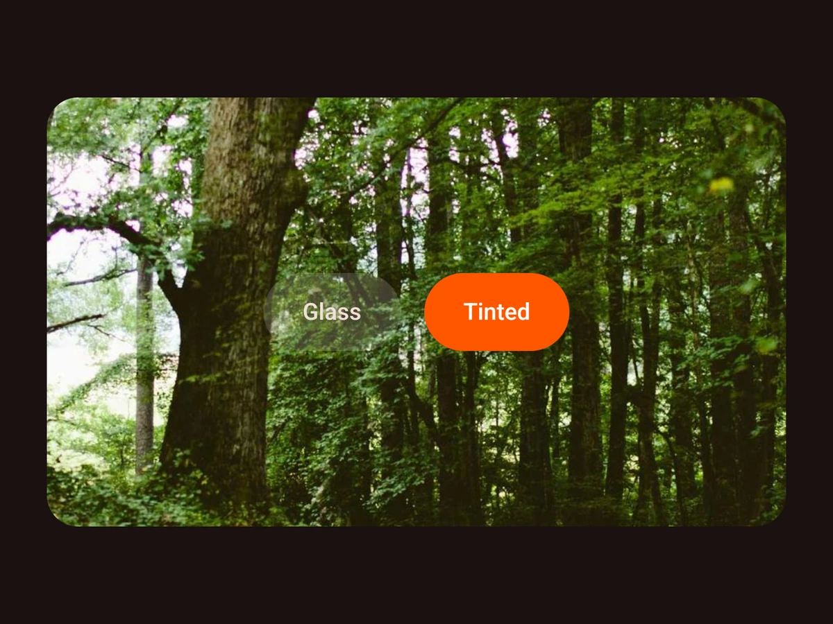
GlassView
Liquid Glass around any React Native content.
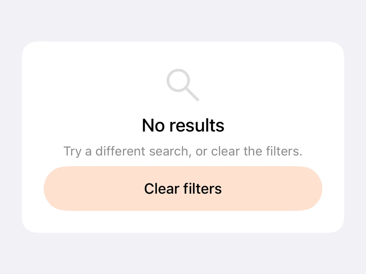
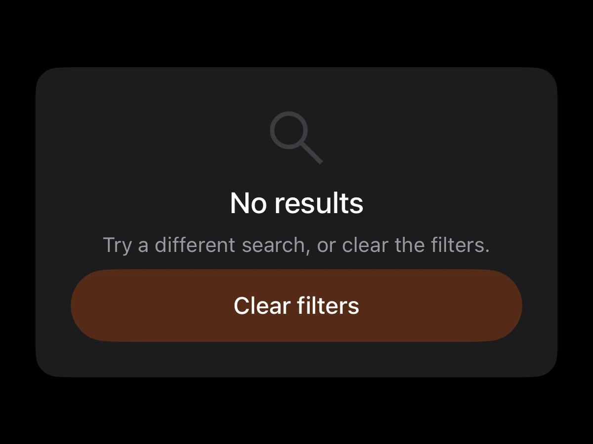
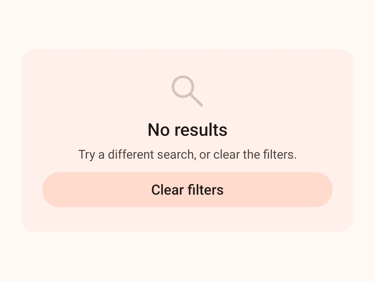
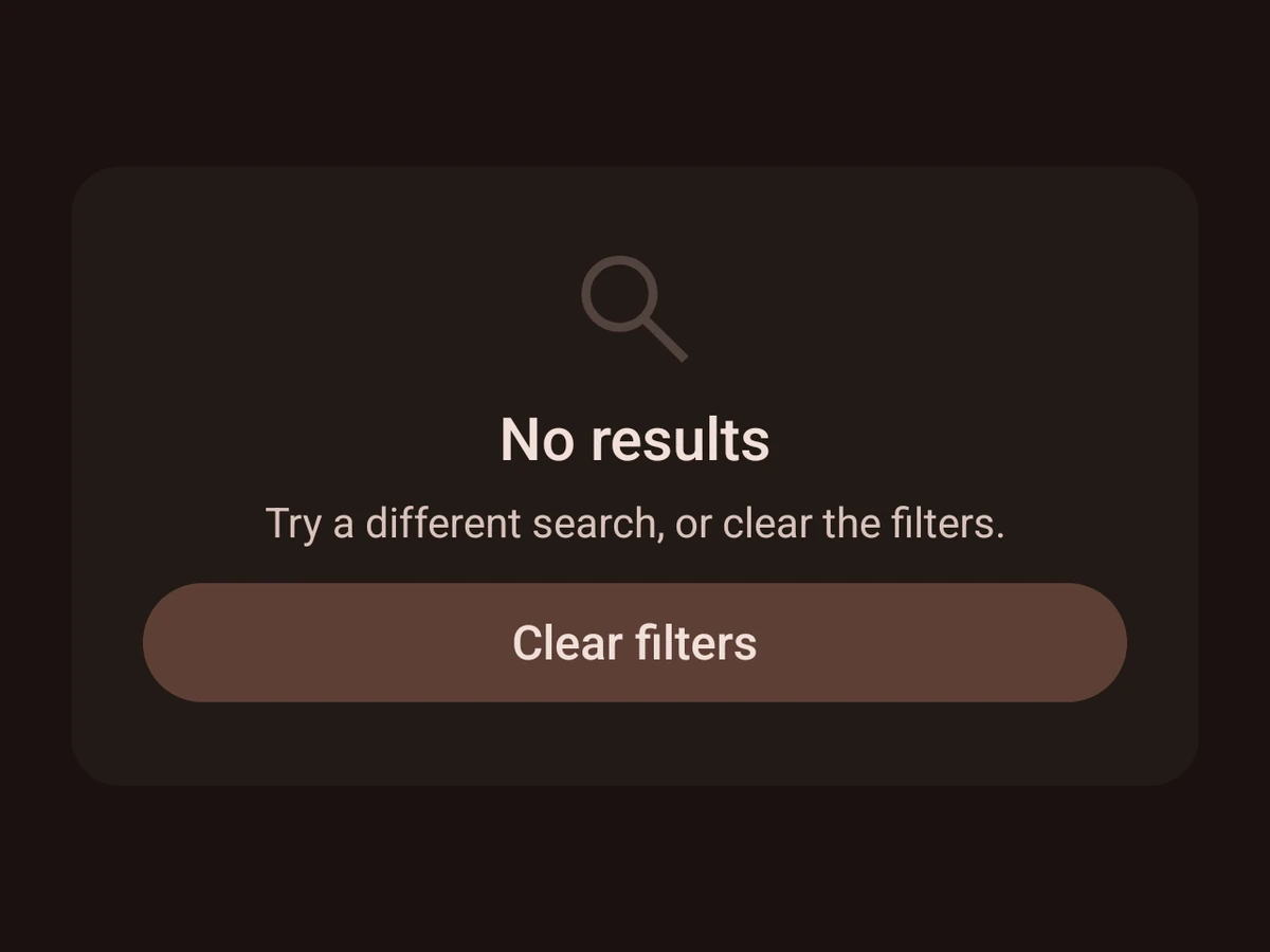
EmptyState
What to show when there is nothing to show.