Text
Text in the type scale, coloured by token.
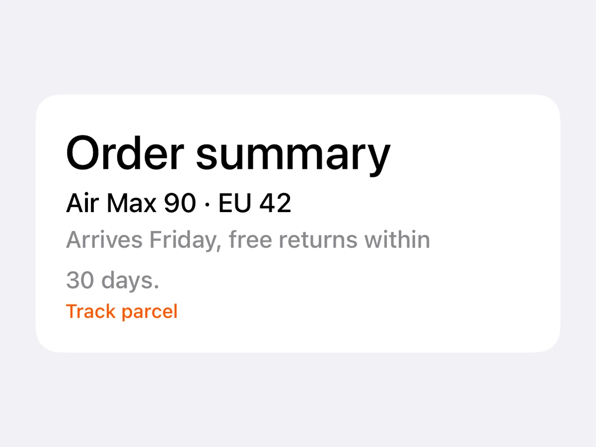



Import
import {Text} from '@hzblj/kara-ui'Props
SwiftUI Text / Compose Text in a theme typography variant — a native atom; outside a host, use RnText.
| Prop | Type | Default | Description |
|---|---|---|---|
| align | 'center' | 'left' | 'right' | — | How its lines align. iOS reads |
| children | ReactNode | — | The text. |
| color | ColorToken | 'content.primary' | The text's colour. |
| decoration | 'none' | 'strikethrough' | 'underline' | — | An underline or a strikethrough. |
| numberOfLines | number | — | The most lines it wraps to. iOS truncates the last with an ellipsis; Android clips it. |
| testID | string | — | Test identifier, forwarded to the native view. |
| transform | 'lowercase' | 'uppercase' | — | Upper- or lower-cases the text. Android applies it only when |
| variant | TextVariant | 'body' | The typography variant. |
How its lines align. iOS reads left and right as leading and trailing, so they flip in a right-to-left layout; Android keeps them as they are.
The text.
An underline or a strikethrough.
The most lines it wraps to. iOS truncates the last with an ellipsis; Android clips it.
Test identifier, forwarded to the native view.
Upper- or lower-cases the text. Android applies it only when children is a plain string.
Platform notes
- Native text, inside a host. Outside one, use
RnText— same variants, same colours. - Every variant grows with Dynamic Type on iOS and font scale on Android.
- With
numberOfLines, iOS ends the last line with an ellipsis; Android clips it.