Content
Card
A raised container for one piece of content.
iOSSwiftUI VStackAndroidCompose ColumnRenders in a Screen or an Island


Import
ts
import {Card} from '@hzblj/kara-ui'Props
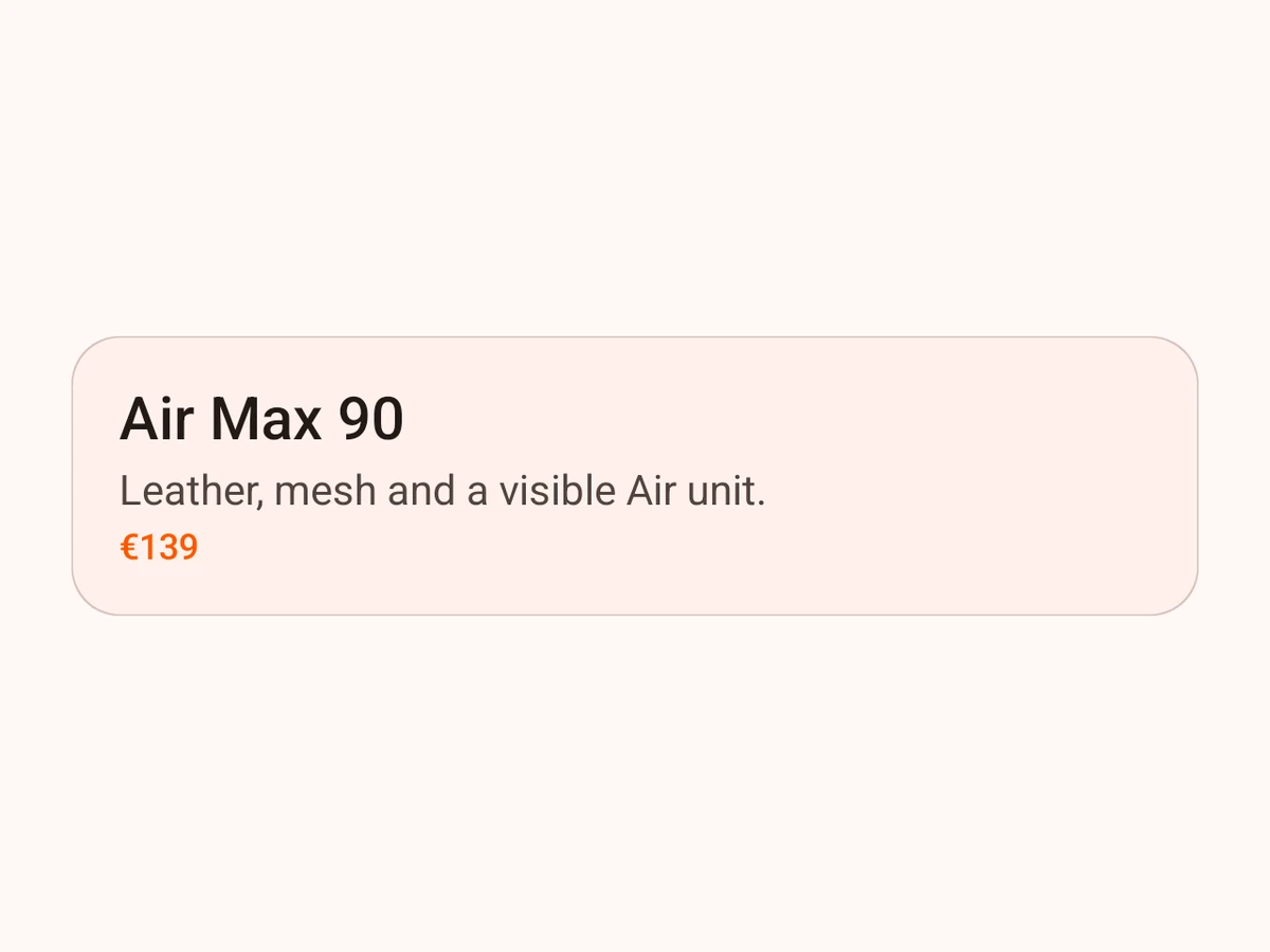
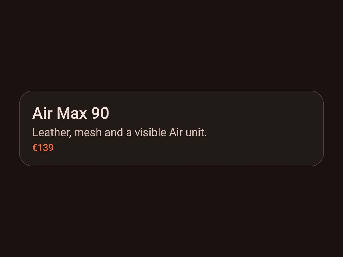
A raised container — SwiftUI VStack / Compose Column on surface.primary, with a large radius, s16 padding and the card shadow. Any sx prop overrides its default.
Also takes the native `sx` props.
| Prop | Type | Description |
|---|---|---|
| children | ReactNode | Native views, stacked vertically from the leading edge. |
| testID | string | Test identifier, forwarded to the native view. |
children
ReactNodeNative views, stacked vertically from the leading edge.
testID
stringTest identifier, forwarded to the native view.
Platform notes
- Carries
surface.primary, thecardshadow and a large radius on both platforms — passsxprops to override any of them.