Content
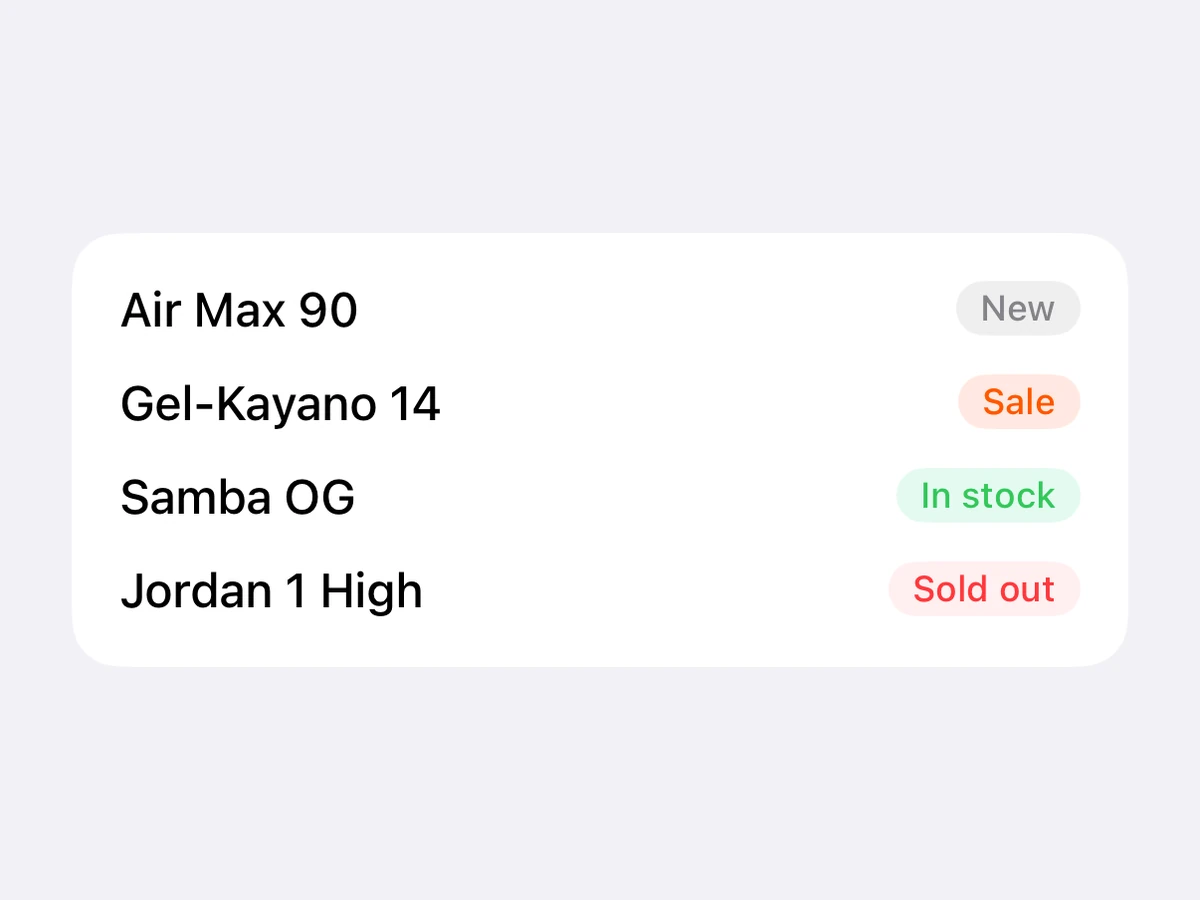
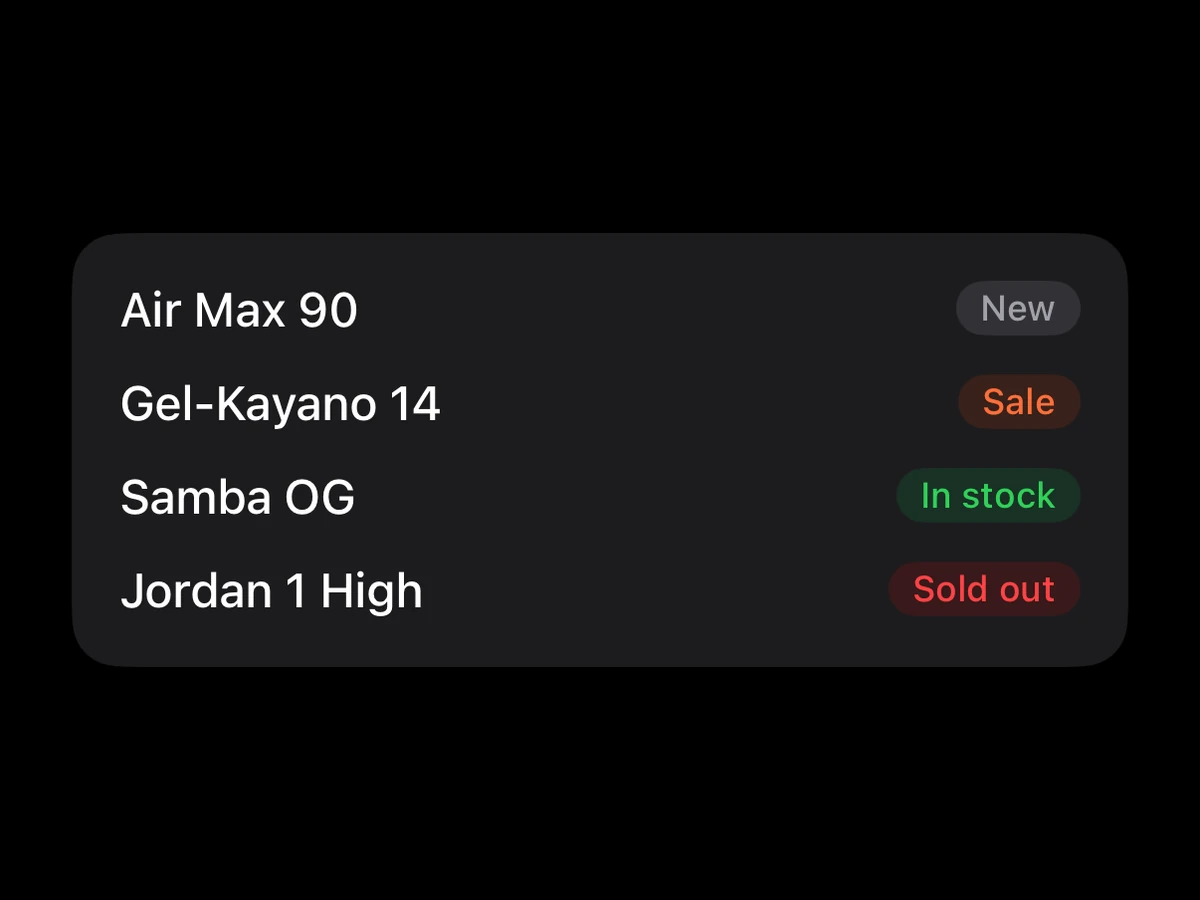
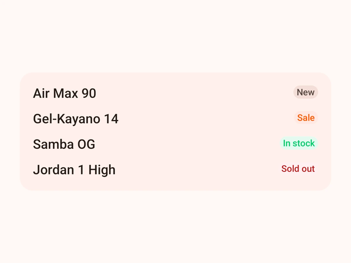
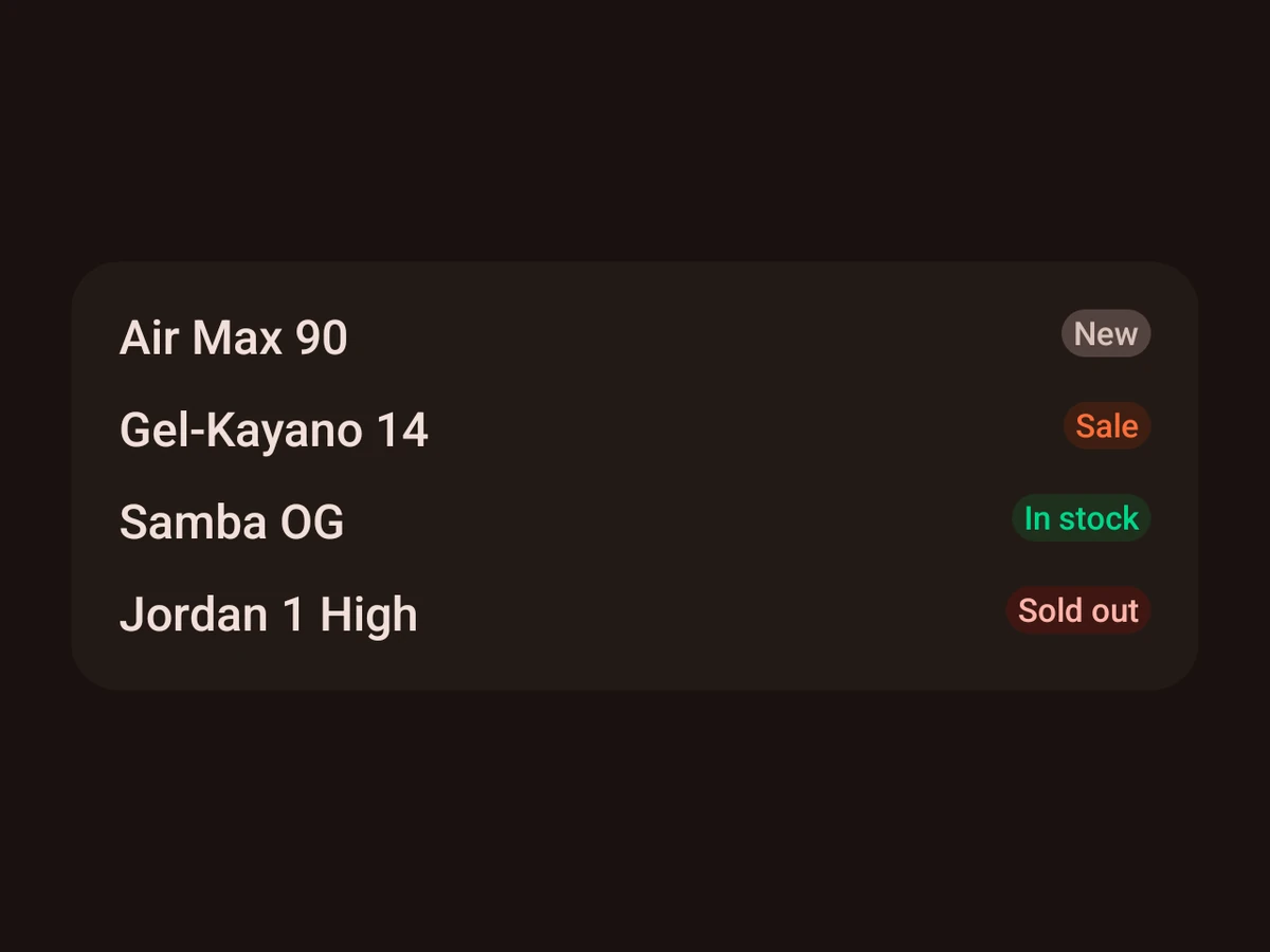
Badge
A small status label.
iOSSwiftUI capsuleAndroidCompose BadgeRenders in a Screen or an Island
Import
ts
import {Badge} from '@hzblj/kara-ui'Props
A small status label in a capsule — a SwiftUI HStack in the tone's fill on iOS, Material's Badge on Android.
| Prop | Type | Default | Description |
|---|---|---|---|
| label* | string | — | The text inside. |
| tone | 'accent' | 'destructive' | 'neutral' | 'success' | 'neutral' | The fill and text colours. |
label*
stringThe text inside.
tone'neutral'
'accent' | 'destructive' | 'neutral' | 'success'The fill and text colours. neutral by default.