Layout and lists
Form
Grouped sections of settings and fields.
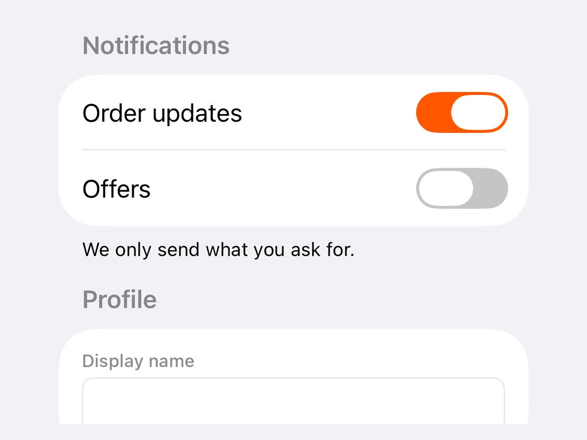
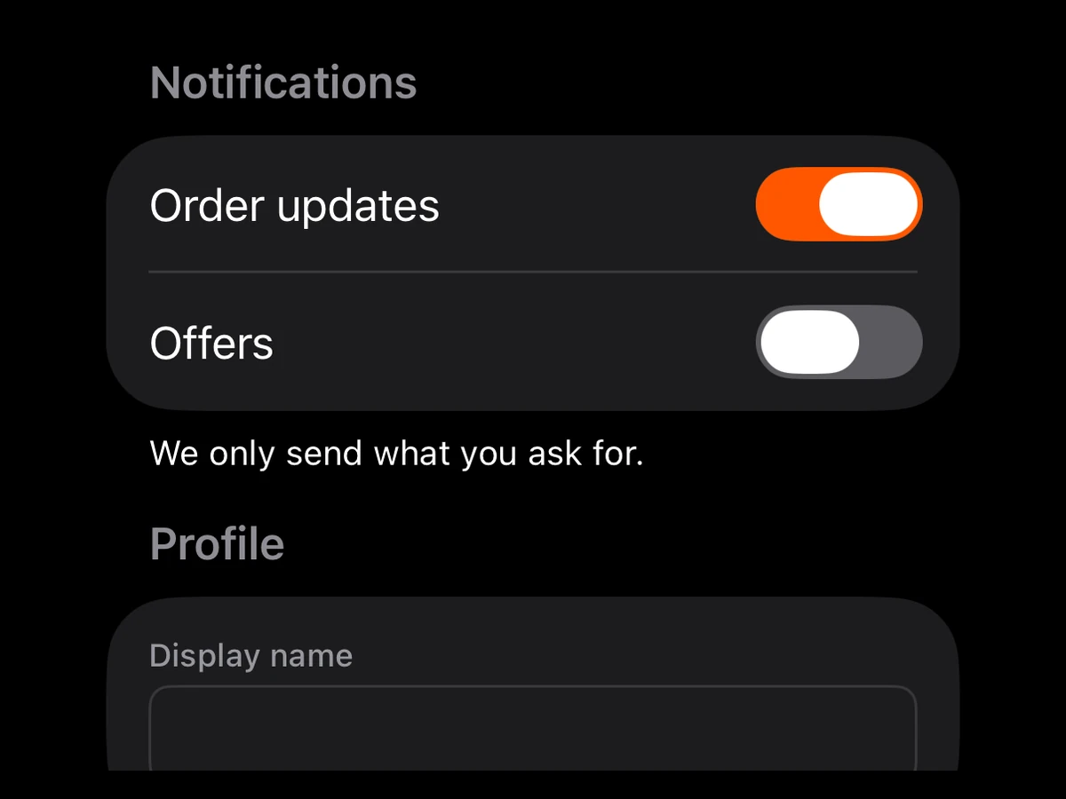
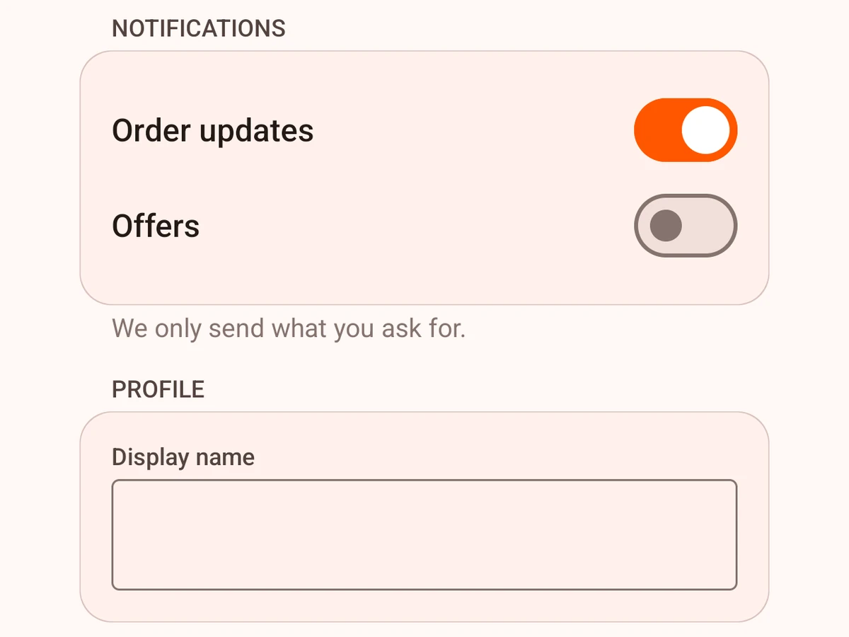
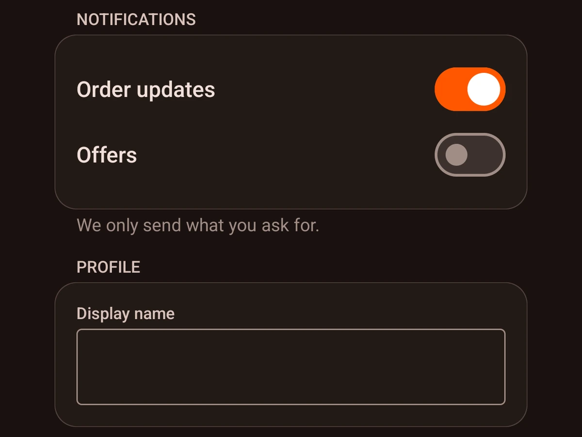
iOSSwiftUI FormAndroidCompose cardsRenders in a Screen or an Island
Import
ts
import {Form} from '@hzblj/kara-ui'Props
A settings form — SwiftUI Form with its grouped sections, Material cards on Android. On iOS it scrolls like a List, so it needs a height from outside: a Screen, or an Island with matchContents={false} and a height. In an island that sizes itself to its content it has no height and shows nothing.
| Prop | Type | Description |
|---|---|---|
| children* | ReactNode | The form's |
| testID | string | Test identifier, forwarded to the native view. |
children*
ReactNodeThe form's Form.Sections.
testID
stringTest identifier, forwarded to the native view.
Form.Section
A group of rows in a Form: a SwiftUI Section on iOS, a Card under a heading on Android.
| Prop | Type | Description |
|---|---|---|
| children* | ReactNode | The section's rows. |
| footer | string | Small print under the section. |
| title | string | The section's heading. |
children*
ReactNodeThe section's rows.
footer
stringSmall print under the section.
title
stringThe section's heading.
Platform notes
- On iOS a form scrolls like a list and needs a height from outside. On Android it is a column of cards that sizes itself — inset from its container and with its titles indented to the cards’ content, like SwiftUI’s grouped form.