Content
Icon
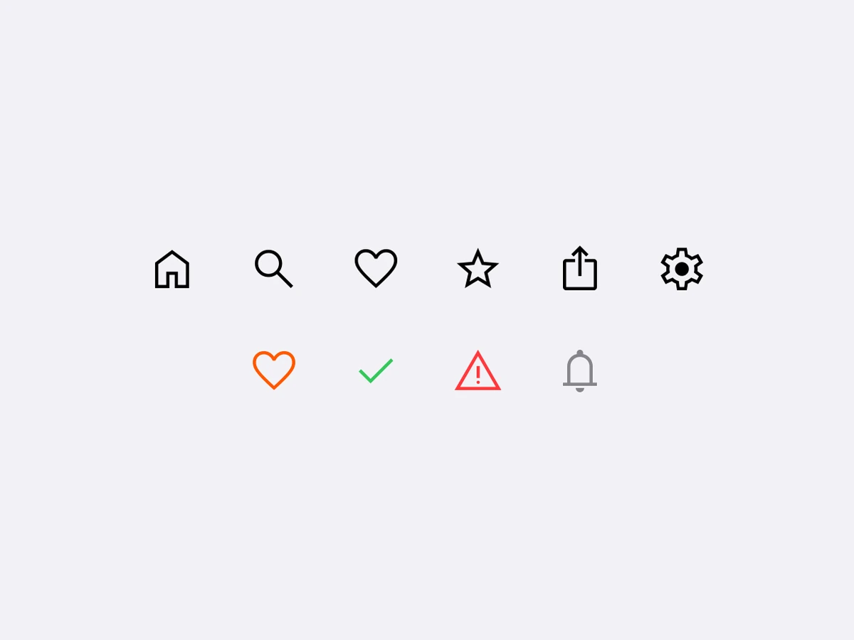
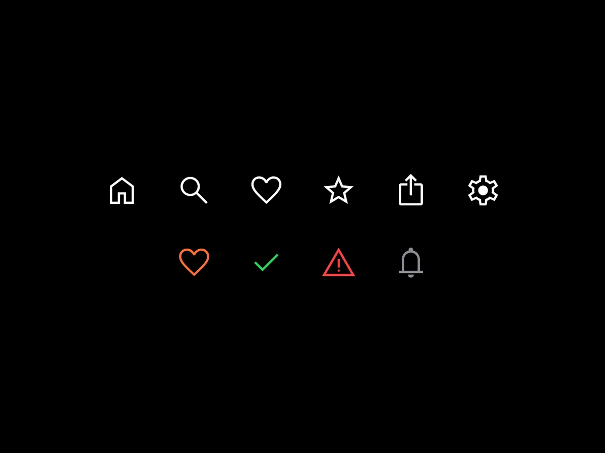
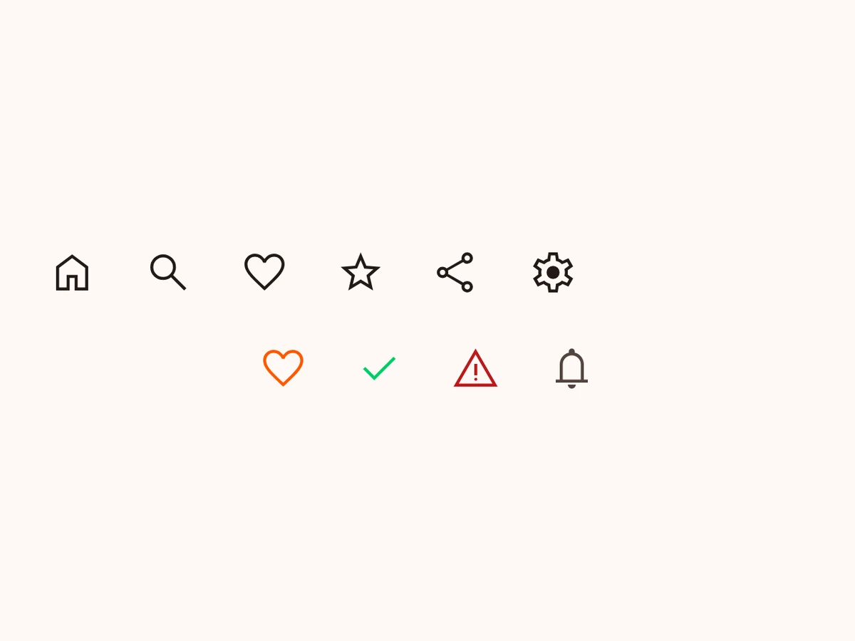
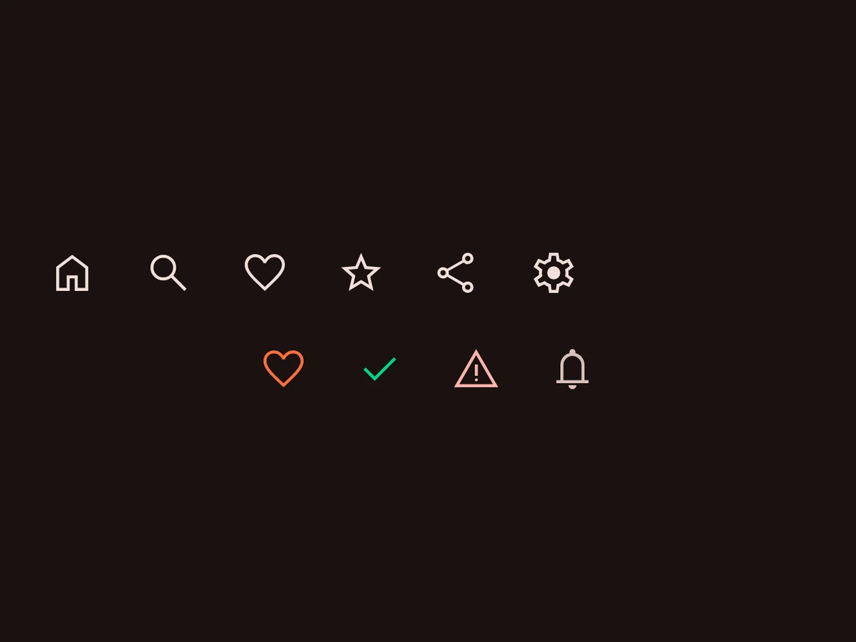
Your own SVG icons, drawn natively in both tiers.
iOSSwiftUI Image from the asset catalogAndroidCompose Icon with a vector drawableRenders in a Screen or an Island
Import
ts
import {Icon, RnIcon} from '@hzblj/kara-ui'Props
One of the app's icons, in a host — SwiftUI Image from the asset catalog on iOS, Material's Icon with the vector drawable on Android. RnIcon draws the same asset outside one.
| Prop | Type | Default | Description |
|---|---|---|---|
| name* | IconName | — | Which of the app's icons — a key of |
| accessibilityLabel | string | — | What a screen reader says. Unset, the icon is decorative and hidden from it. |
| color | ColorToken | 'content.primary' | The icon's tint. |
| size | SpaceSize | 's24' | Its width and height, a spacing token. |
| testID | string | — | Test identifier, forwarded to the native view on iOS — Android ignores it. |
accessibilityLabel
stringWhat a screen reader says. Unset, the icon is decorative and hidden from it.
testID
stringTest identifier, forwarded to the native view on iOS — Android ignores it.
Platform notes
- Your own SVGs, made native at prebuild by the config plugin — see Icons. The library ships no icon set.
Icondraws inside a host;RnIcondraws the same asset anywhere in React Native layout.