Selection and input
ColorPicker
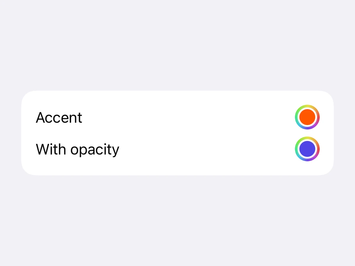
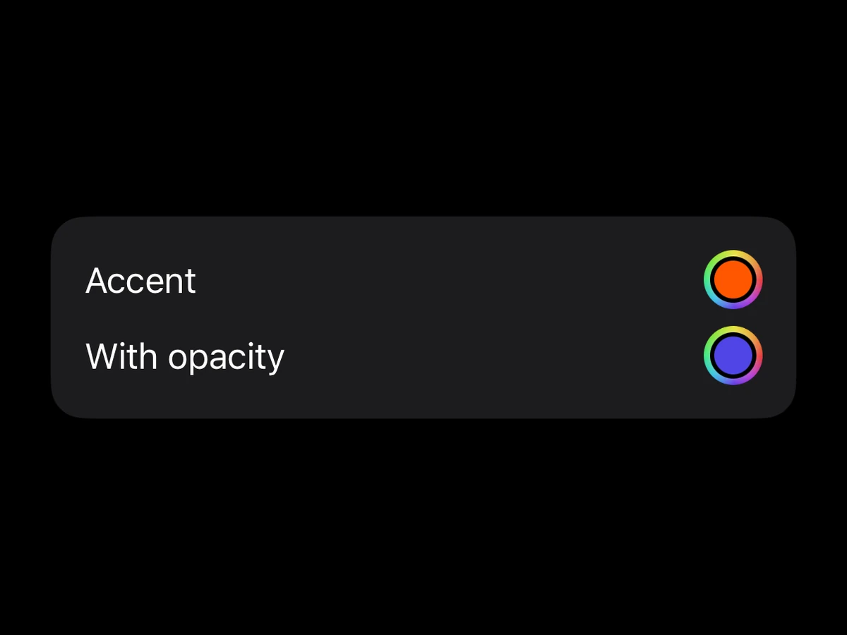
The system colour picker.
iOSSwiftUI ColorPickerAndroid—Renders in a Screen or an Island
Not on AndroidSee the platform notes below.
Import
ts
import {ColorPicker} from '@hzblj/kara-ui'Props
The system colour picker. iOS only — Compose ships no equivalent, so on Android this renders nothing and says so in dev. Branch on Platform.OS if the screen needs a fallback.
| Prop | Type | Default | Description |
|---|---|---|---|
| value* | string | null | — |
|
| label | string | — | Text beside the colour well. |
| onValueChange | (color: string) => void | — | Called with the colour the user picks. |
| supportsOpacity | boolean | iOS false | Lets the user pick an opacity as well. Off by default. |
| testID | string | — | Test identifier, forwarded to the native view. |
value*
string | null#RRGGBB or #RRGGBBAA.
label
stringText beside the colour well.
onValueChange
(color: string) => voidCalled with the colour the user picks.
supportsOpacityiOS false
booleanLets the user pick an opacity as well. Off by default.
testID
stringTest identifier, forwarded to the native view.
Platform notes
- iOS only — Compose has no colour picker, and on Android it renders nothing (with a dev warning).