Content
Label
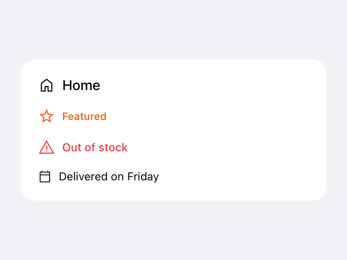
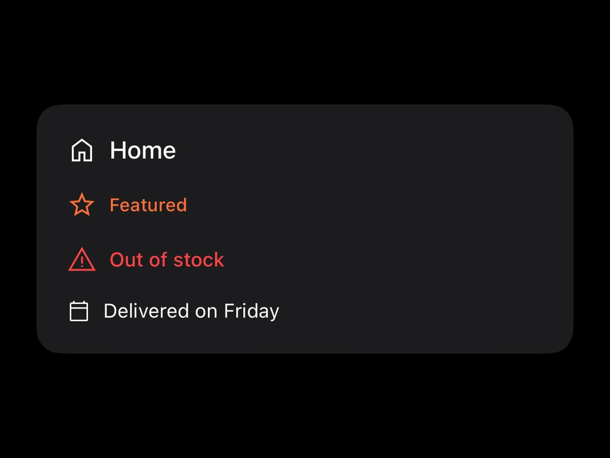
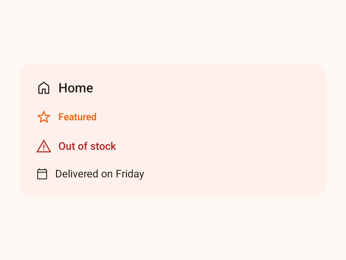
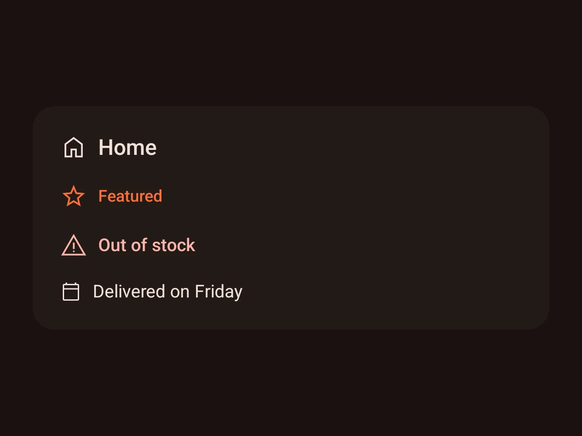
An icon and a short text, aligned.
iOSSwiftUI HStack of Image and TextAndroidCompose Row of Icon and TextRenders in a Screen or an Island
Import
ts
import {Label} from '@hzblj/kara-ui'Props
An inline icon + text pair — the thing you put inside a button, a menu row or a section header. For a full tappable row with a subtitle and chevron, use ListItem.
| Prop | Type | Default | Description |
|---|---|---|---|
| icon* | IconName | — | One of the app's icons, before the title. |
| title* | string | — | The text beside the icon. |
| color | ColorToken | 'content.primary' | Colours the icon and the title alike. |
| iconSize | SpaceSize | 's20' | The icon's size. |
| testID | string | — | Test identifier, forwarded to the native view. |
| variant | TextVariant | 'body' | The title's text style. |
title*
stringThe text beside the icon.
testID
stringTest identifier, forwarded to the native view.
Platform notes
- An inline pair for a button, a menu row or a section header. For a tappable row with a subtitle, use
ListItem.