ScrollView
A native scroll view.
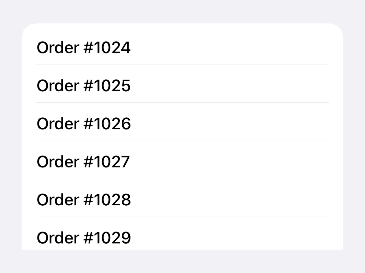
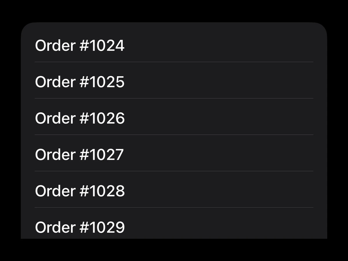
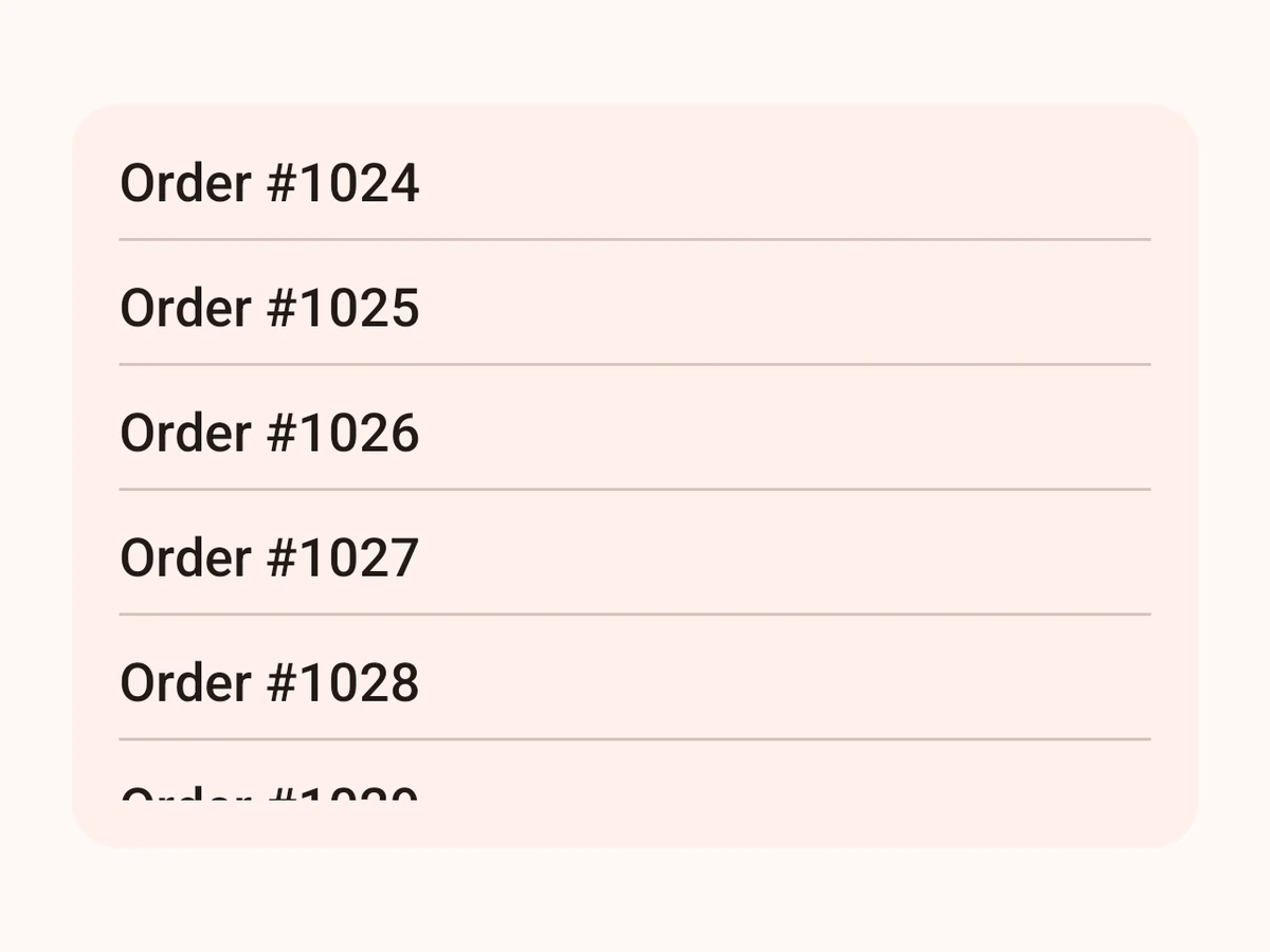
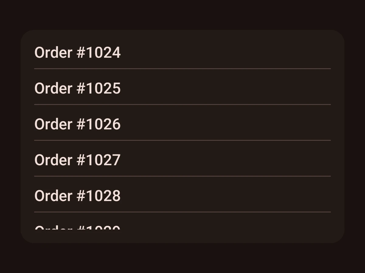
Import
import {ScrollView} from '@hzblj/kara-ui'Props
The sx props style the scrolling content container, not the viewport — p behaves like React Native's contentContainerStyle padding and scrolls with the content.
Also takes the native `sx` props.
| Prop | Type | Default | Description |
|---|---|---|---|
| axis | 'horizontal' | 'vertical' | 'vertical' | The scroll direction. |
| children | ReactNode | — | Laid out in a stack along |
| onRefresh | () => Promise<void> | — | Enables pull-to-refresh. Async on purpose: the spinner runs until the promise settles, which is what SwiftUI's Only a vertical scroll view can be pulled; on a horizontal one both platforms ignore it. |
| showsIndicators | boolean | iOS true | iOS only — Compose exposes no indicator toggle, so Android always shows the native one. |
| spacing | SpaceSize | — | The space between children. |
| testID | string | — | Test identifier, forwarded to the native view. |
The scroll direction. vertical by default.
Laid out in a stack along axis.
Enables pull-to-refresh. Async on purpose: the spinner runs until the promise settles, which is what SwiftUI's refreshable expects and what Compose's controlled indicator is driven from — so neither platform needs a separate refreshing flag to be kept in sync by the caller.
Only a vertical scroll view can be pulled; on a horizontal one both platforms ignore it.
iOS only — Compose exposes no indicator toggle, so Android always shows the native one.
Test identifier, forwarded to the native view.
Platform notes
- The native scroll container, for a subtree that is native all the way down. Its
sxstyles the scrolling content. - For a React Native subtree, use
RnScrollViewinstead.